This is the current ident for BBC News.
This is the current ident for BBC News.
Exiting bumper
Introducing bumper
All on screen graphics for BBC News Breakfast – includes lower third and live band.
I designed the bumpers to spin out the way they do because it relates to the circles that are shown on the ident for BBC News. They tie in with BBC One because sometimes BBC News is shown on BBC One, but only for 2 hours a day, once at 1pm and once at 10pm. Instead of making a fancy pants pair of bumpers, I chose to make it a little more minimalist but still keep the theme of circles. All that is left to do now is create a title reveal for BBC Breakfast and an Ident for BBC News.
I was in charge of designing the website using the other aspects of design that we have for the packaging and the logo. I put them together in Photoshop and sent them to the other team members for some feedback.
At first, the logo was white and green, which Gemma picked up on that it would get lost in the design because the background is quite light. So I changed it to a dark brown, which made it stand out a lot more. These are the images for the desktop website.
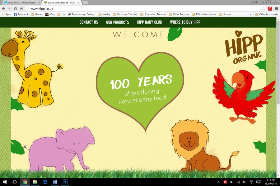
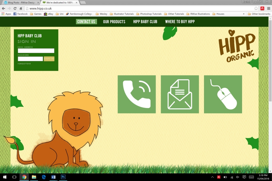
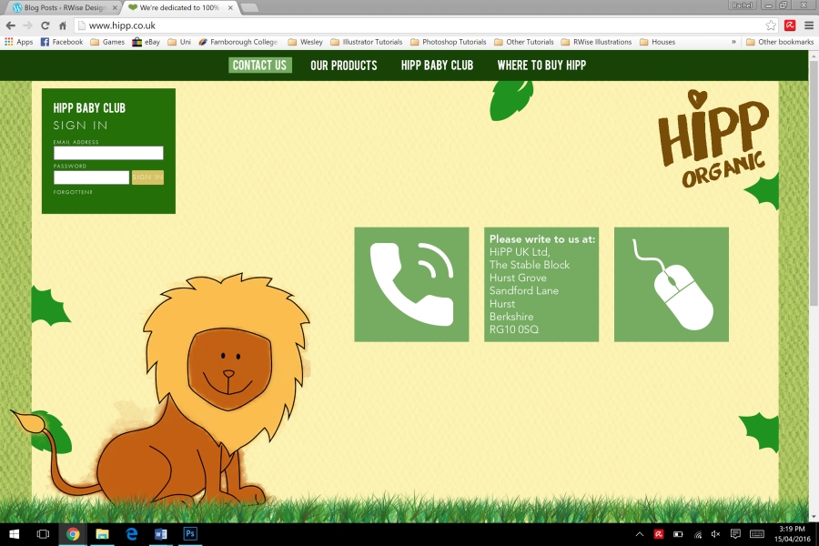
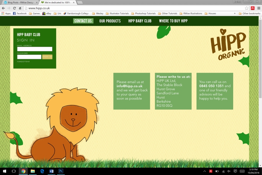
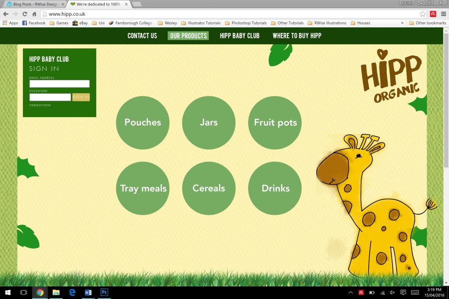
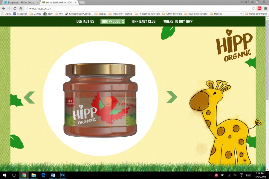

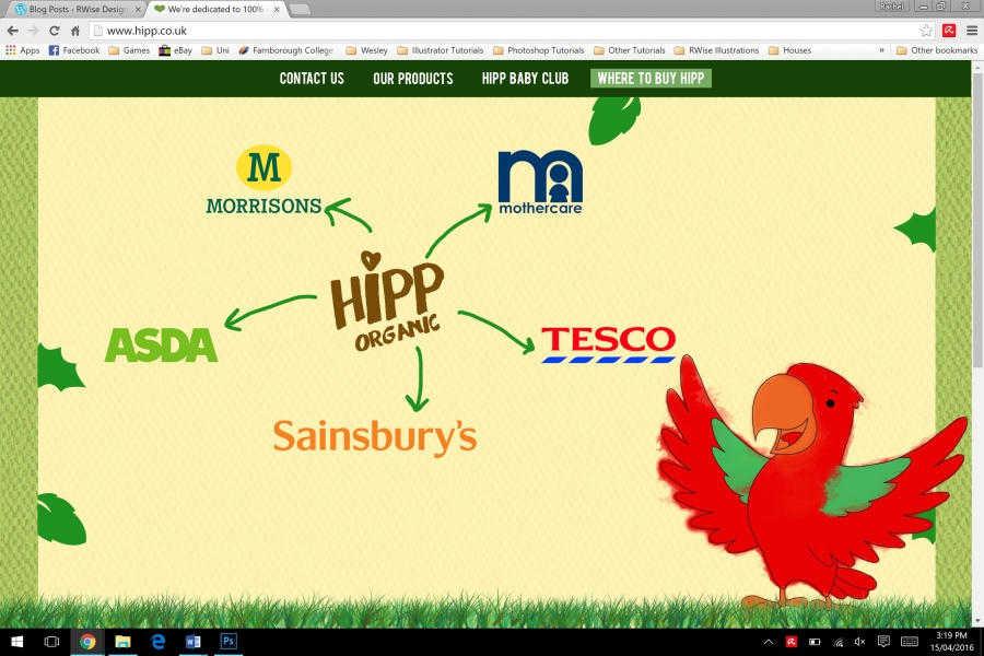
I tried to keep the colour scheme quite consistent because sometimes sites with an inconsistent colour scheme don’t piece together very well. The one thing that is different on each page is the animal. Instead of having all of the animals on the page, I decided to put one on each because it would be similar to the way we have done our packaging – one animal per flavour.
There are also some designs for mobile devices because we had to design for a range of platforms. I just simplified the pages and put a hamburger menu at the side – I think these designs work well because even though they are simplified they have all of the information on.


For my assignment I have chosen BBC News Breakfast as a programme, and BBC News as a channel. I started putting together some boxes and text in After Effects, and created a lower third with a headline, a lower third with a reporter name which turns into a headline, and a band that appears in the top right corner which would be seen when the broadcast is live.
This is a lower third that just shows the headlines with some scrolling text that talks about some other stories. This was the first lower third that I did, which I was very proud of because it was really difficult to get the boxes and to move at the right time and the text to appear at the same time.
This is the same lower third, which starts out with the name of the reporter and then changes to a headline because some news programmes introduce the reporters before they jump into the stories.
This is the live box that appears in the corner of the screen, which looks pretty good. They are easy to make because they are really minimalistic. It is really easy to change the location in the box because it is a text layer. The only thing that you would really have to change is the length of the red box that the text appears on.
This is all of the elements combined, a lower third with an introduction for the reporter, with the live band at the top of the screen. If I were to put this on top of some footage, it would look quite professional.
I took this approach with the lower thirds because it makes the breakfast show look more news like. Rather than watching people talk, there is something to look at on the bottom, even though it doesn’t stay there for very long. The lower thirds would be shown at the beginning of the show and then would disappear after 10 seconds. It would show the name of the presenter and then a headline for the viewers to read, then would disappear so that the viewers could listen to what the presenter is saying.
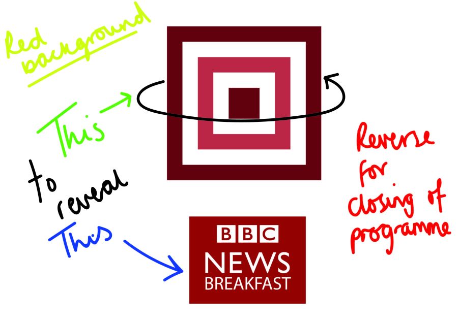
This is the ident for the BBC News – which reveals the logo at the end for BBC News. This ident is very similar in terms of shapes to the BBC One ident. BBC News is shown on BBC One so it would make sense that they would look similar in terms of shapes.
From 3:00 to 3:10 is the Breakfast show’s title reveal on BBC News. It’s hard to pin point an actual title reveal because it’s a programme within a programme. It’s almost like a section, like the weather.
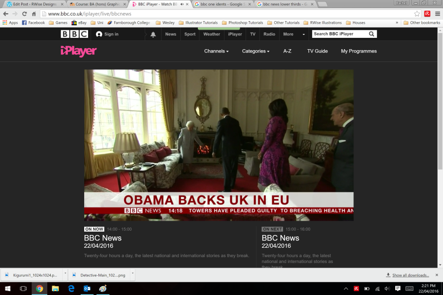
I chose to look at BBC News as my channel as BBC are a big company and a wide brand, and the programme that I am going to look at is BBC News Breakfast. In my research I looked at the channel Gold and looked at Sky as a brand. As Sky has a news channel, I spent an awfully long time watching Sky News and looked at all their on-screen graphics. They use a wide range of lower thirds and bumpers between stories. Looking more at BBC news as a channel, they also have a lot of lower thirds like Sky News, but it is expected of a news channel to have a lot of lower thirds, especially when people are introduced.
Most of the on-screen graphics are red and white with either black text or white text depending on the background colour. I thought that it was weird that the presenters names didn’t appear when they started talking but it turns out that they’ve been introduced before, or are regular / main news reporters so don’t necessarily need introducing with a lower third. Guest speakers would be introduced with a lower third regardless of how well known they are.
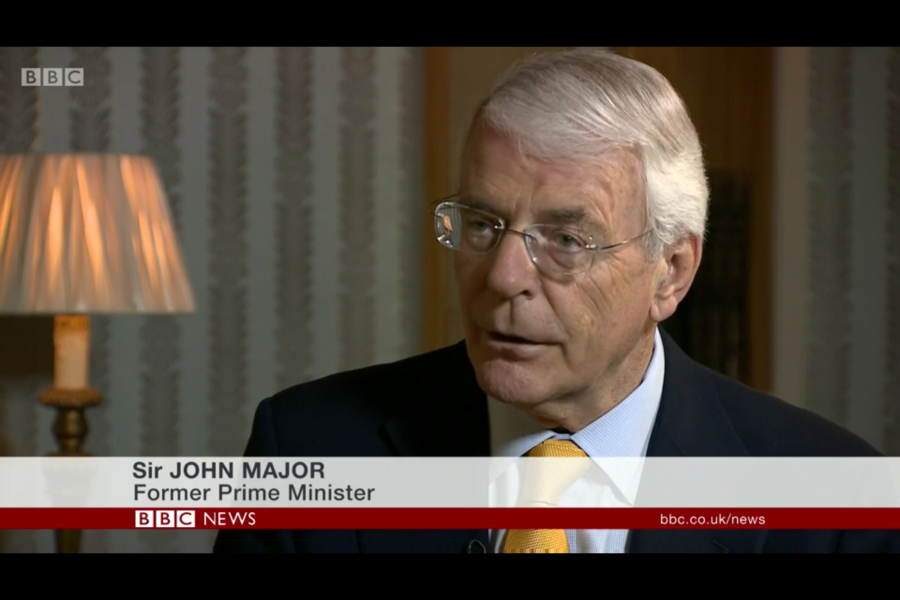
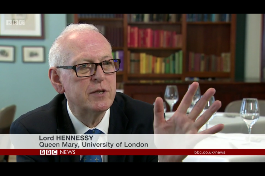
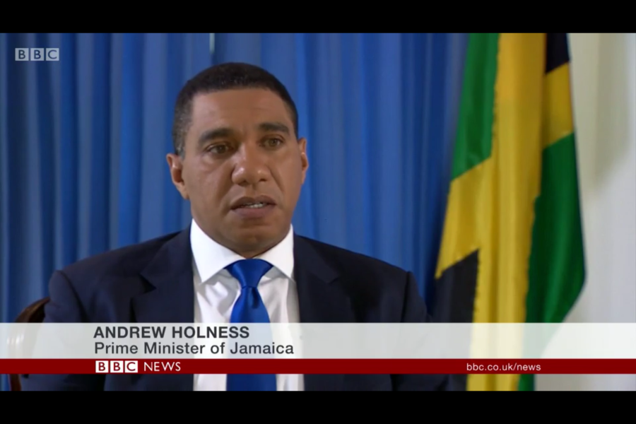
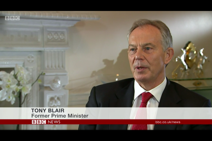

All of the lower thirds that introduce a guest speaker are identical, which makes BBC as a brand look very professional because they are very coherent in their designs. The only thing that is obviously different is the name of the person and their occupation. The logo and the website for the BBC is on each lower third which also means that the viewers can go to the website to either find out more or to catch up on news that they may have missed.
Other on-screen graphics include the lower thirds that have headlines on them, and the information that scrolls through the most popular stories.
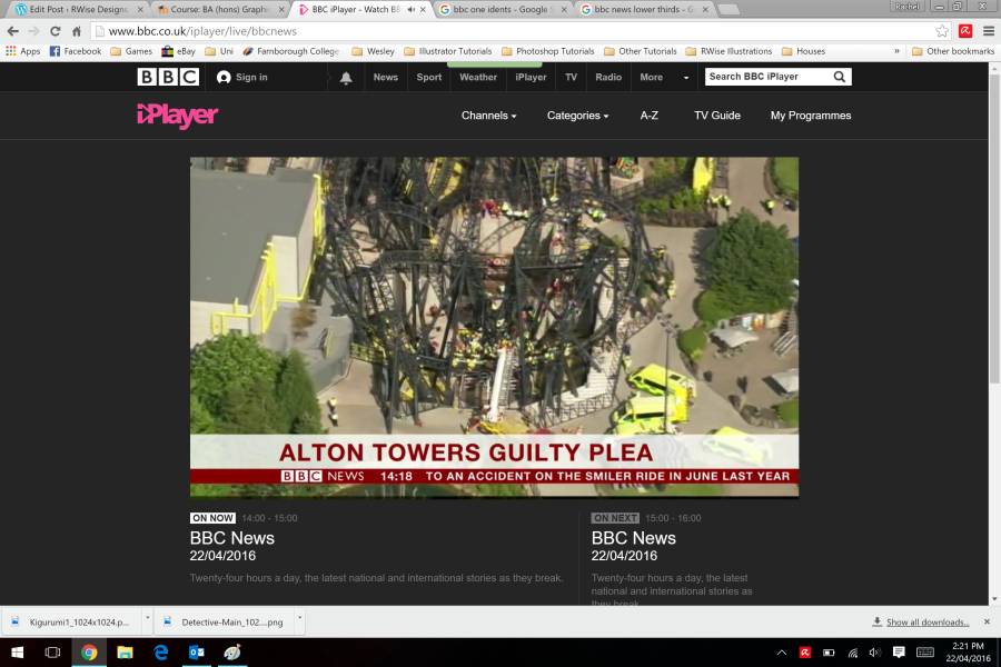
These on-screen graphics can only been seen when watching the news on live stream because it plays as a loop and replays the different stories. When the lower thirds come up on this part, there is the logo in the same place as the other lower thirds which display the name of a guest speaker, but next to the logo is the current time, and next to that is a section of scrolling text which displays the most popular stories.
During certain news stories, there are images and text boxes that appear on-screen accordingly. These could display quotes from what people have said, or from social media. When they are from social media, you can tell because they show the quote as if it were pulled from the website itself.
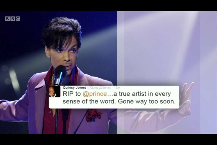
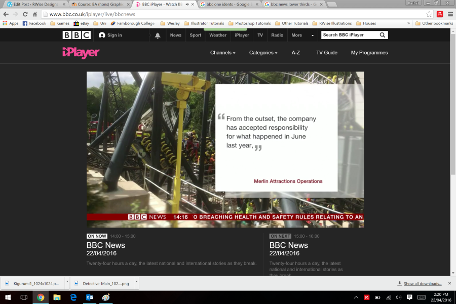
By doing this, in my opinion, it grabs the attention of the audience because they have spent the majority of their time watching someone talk so by adding these graphics, the viewers have something else to look at which could engage them a little more.
Two more things that I spotted while watching BBC News was that their logo is displayed after the introducing ident over the footage. Also, when there are images and videos being displayed, a small white bar appears in the bottom right corner with the source name.
The final thing that I spotted, which wasn’t on the live stream of BBC News, it was on one of their other sections of news called Hard Talk, which is when guest speakers are called in for interviews about a particular subject. The one that I found was Tim Martin, the CEO and Founder of J D Wetherspoon talking about the effects that either leaving or staying in the EU would have on his company, based on his views.
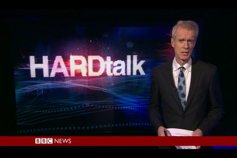
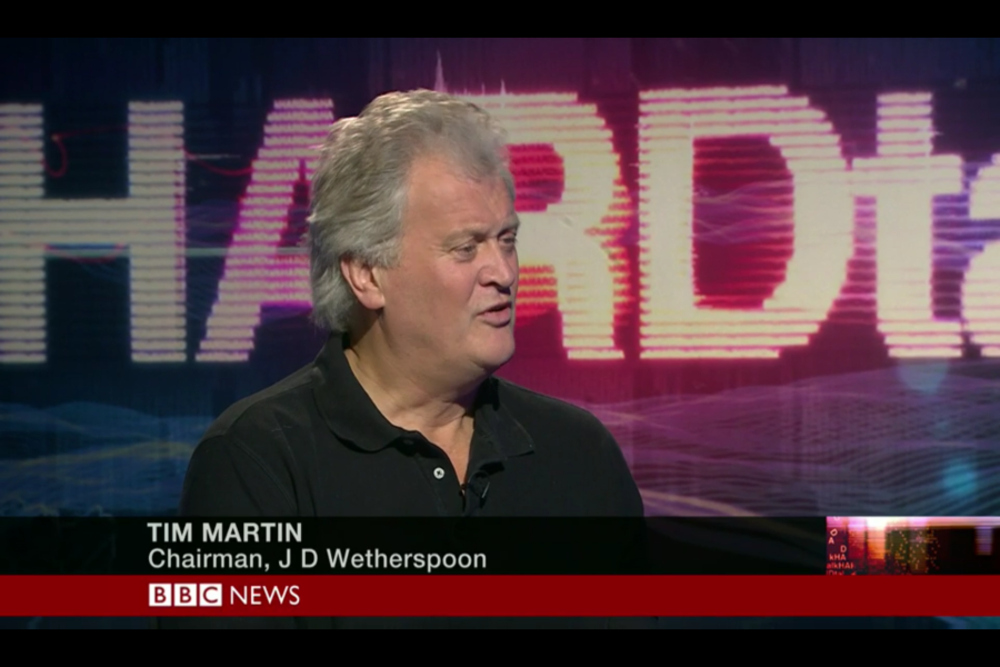
The on-screen graphics for Hard Talk are very similar to the ones that are used on the BBC News live stream, and BBC Breakfast except the parts where the name and blurb appears are black boxes with white text rather than a white box with black text.
Set up a new comp – HDTV 1080p 25 FPS, make sure you have square pixels – for this one, take the duration down to 10 seconds and 0 frames. 0;00;10;00 You can always go into the settings and change this if you’ve already made your composition.
We normally bring video files of Illustrator files into After Effects, but this time, we’re doing everything from scratch. Make sure your background colour is something light and you will be able to see what you’re doing a little more. If you want to make sure everything is lined up perfectly, go to View > Show Rulers and View > Show grids. You can change the way your grid looks in Edit > Preferences > Grids & Guides if you want to, just like all the other Adobe applications.
Use the rectangle tool to draw a rectangle, and choose any colour fill and no stroke for your shape. Looking at the timeline window, we get various options for it like path, stroke, and fill. You can change the roundness, position, and the size, but we want a normal rectangle. Turn your rectangle into a bezier path, Right Click on “Rectangle” on your shape layer drop down in the timeline window and click Conver to Bezier Path. This makes our shape a path which means we can grab the pen tool and add and take away anchor points to make the shape a little more interesting.
Move it to where you want it to appear on the screen (I chose bottom left corner) and duplicate the shape using CRTL+D / CMD+D. Now, on duplicate layer change the colour and move underneath the other shape in the layers window. The reason for duplicating the layer is simply for timesaving reasons, and we want the angles to match up.
Add two text layers for the name on top shape, and the blurb on bottom shape. The nice thing about doing it this way is that it turns them into paths so we can manipulate them easily and everything is happy. (her words)
This is just a static image at the moment. They will animate in from one side and reveal itself. If we select one of the shapes, the anchor point is way away from the shape which is no good to us, so we need to shift it with the pan behind tool which is the square with four arrows icon. The keyboard shortcut is Y. That way we can grab it and shift it onto the centre, left anchor point. Now if we want to scale it, it scales it from that point and that point only. Now we’re going to start animating it. But we’re not going to start it moving or appearing immediately. Give it a second before you start making it appear on-screen.
We should have two shape layers and two text layers. We’re just going to use the scale tool to animate them, select shape layer 2 and press S, it will just bring up scale tool rather than all of the other options and on the timeline, move the playhead along to 1 second. At the moment, if we change the scale the whole thing scales up and down which isn’t want we want. Unlink it with the chain icon next to scale options for the X & Y axis, then we can set initial scale to 0 and move it along a little bit and set the scale to 100 so that the shapes come all the way in and are revealed.
Now, on shape layer 2, select both of your scale keyframes, and on the other shape layer, move the playhead so that it is slightly earlier than the other scale properties and press CTRL+C and CTRL+V / CMD+C and CMD+V and it will put in those 2 keyframes and their values on the other shape layer.
You can add easing onto your shapes if you really want to, ease to your hearts content.
The graphics slide in but the text isn’t animating, so we’re going to use track matting to reveal them because it will make it appear nicely.
We currently have a range of text layers and shape layers, now we are going to make duplicates of both of our shape layers. Select a layer and press CTRL+D / CMD+D to duplicate it, and what we’re going to do is set it up that the duplicate shape is underneath the text layer that the shape is on. So:
Text layer for the name
Duplicate shape for the top shape
Text later for the blurb
Duplicate shape for the bottom shape
Original shape for the top shape
Original shape for the bottom shape
Under the Track Matte settings, set the text layers to alpha and set the fill colour to the colour that you want your text to be. Because we duplicated the layers, we have the scale settings from the other shape. Select the keyframes for the duplicate layers and shift them along a little later so the shape comes on first, and then the other shapes come in which reveal the text.
You have your lower third!
You can duplicate your original shapes, which we can then shift over slightly to create a two-tone shape with the same shape and the same motion. This just gives it a little more depth, and you can move the shapes along with the position settings. Because we have it all as one setting, if we want it to animate in and then out, we can pre-compose it. Select all of your layers, and right click and select pre-compose. This will move everything into a new composition. Now, shrink the precomp down to half of the time of your workspace (5 seconds), duplicate it and shift it to the other half of your workspace and right click it. Now, click time reverse layer and you have a lower third that reveals and disappears.
You can add time remapping by right clicking and enabling time remapping. You could also press CTRL+ALT+T – I don’t know what the mac shortcut is though.
Once you have turned on time remapping, we have a keyframe at the start and the end of the workspace. If we move the end frame to the middle of the composition, it will speed up the first section where it would come onto the screen.
Add to render queue, we don’t want the white to be there, if we are giving this as actual footage, they could key out the white but it’s just hassle and gives someone else something to do. Under settings, the video output channel needs to be RGB + alpha. If you output it as this, we keep the transparency which means you can put it on top of anything.
We were carrying on with what we did last week with the null objects and cameras in After Effects. This time we will be working with existing footage and tracking an object in 3D, and dropping stuff into it because we have already done things with 2D tracking and worked with a static camera shot. With this one, the camera work is footage that is actually moving.
We are used to placing something into an environment and mapping it so that it sticks to an object and as the camera moves, it follows it. This is a simple way with working with the camera tracking – footage is on Moodle. Put it in after effects, create new project and a new comp. HDTV 1080p 25 FPS
Import the footage to After Effects and drag onto your timeline. In the Effects and Presets panel, start typing “3D camera” and it will bring up the option for 3D Camera.
Drag your work area to 2 seconds, which is before she starts moving in the footage, right click and trim your composition to work area to work with just that part of footage.
Drag the 3D camera onto the footage and it will analyse the background. Let it do its thing, and after a while you should have dots pop up everywhere, if they don’t, there is a setting in the effect panel that says render track points – tick it. You can change the size of these points, blow them up to about 200%, so you can see what you’re doing with them.
What the 3D camera has done, because After Effects is quite smart, if you remember when we did the snail motion tracking and we put the markers on the points that the snail was moving, the camera has looked at the footage, analysed it and marked all the points that have changed and can be followed from start to finish. After Effects is able to calculate how the value of a pixel has changed and moved it.
Once this is done, hover your mouse over some of the points and you should get a target come up on the screen depending on which points you are hovering over. This is useful because it calculates the planes based on 3 track points where a flat plane lies. If you hover your mouse around the left side of the screen, you get the target come up. See how the target distorts based on where you are on the screen.
With these points (you can turn this on if you want to with other footage) hit the drop down menu in the effects settings (advanced). Solve method = Auto detect. If you know the footage, for example a pan around of the classroom with digitally placed art on the walls, because you know you have used a fixed tripod to pan the camera around, rather than using auto detect, you would use the tripod setting.
Now what we are going to do is put text on the wall. If you hover over the points around the area that you want to place your text and select them by holding shift and clicking them. Right click on the target and click add text and a camera. This will put text on there and put the camera in the right position which will then allow it to track the motion points you have selected.
With the text, it is tracking the position. You should go into text and adjust angles of it so that it looks like the text is actually on the wall. It tracks the camera but doesn’t distort text accordingly. We can put the text as an overlay layer and drop the opacity down a little. The idea is that it is fixed and moving with the camera. Wherever the motion points go, this is what the text is fixed to.
The reason you click text and camera is that you have created motion points by adding a text and a camera layer at the same time and it attaches the invisible camera to those motion points. When you right click there are other options for shapes etc. You can ad a shape and a camera, and you can replace the shape with something like a photograph, logo, or image, so it lets you adjust it and alter it to whatever you like. You can put a green box on to start with and then change it afterwards.
With your footage, where you have camera trackers etc. the other useful thing can be if you want to put an image on, like a logo, what you would do is import it to the project and when you set track points like we did with text, instead of choosing text and camera, choose a solid because we can replace a solid easily. If you already have a text layer, you can choose another set of points and try putting a image on at the same time.


These are some of the things that I wanted to do for my channel, taking what they already had into account. They have things like live bands at the top of the screen when the reporter is reporting from someone in real time. I got confused at first and thought that BBC News was shown on BBC One, so took the circle route when it came to graphics, but then I thought it would be a good idea to use anyway. At first I was going to use a rectangles, or square, and have it spin around but I didn’t like the idea of it compared with the circle.
Adobe experimented with using liquid as a green screen, and it worked really well. They used paint and slow motion footage to pull off the video and it looks really real despite the unrealistic colours used. The video is shown below.
We downloaded some footage of a red paint splatter on a black background, which is a good piece of footage for us to use because there are only two colours on the screen. I opened up illustrator and created a pattern in a file that had a preset for HDTV 1080 and had the pattern fill the document.
I made the pattern very bright so that we could see the different colours in it, and it would have more of an effect when it appeared on screen.
I scrubbed along the footage so that I could see the colour of the paint and be able to grab it when I need to once the effects have been put onto the footage. In the effects and presets panel, I went to the keying drop down menu and dragged the colour range effect onto the footage.
By grabbing the eyedropper tool on the effects panel, I picked the main colour of the paint and it changed my paint splatter footage to from red, to the pattern that was underneath the footage in my layers panel and ended up looking like this:
I tried it with two different patterns to see what they would look like. I prefer that one with circles because it looks a lot more realistic because there are three colours and not just two. They both look really good, I just prefer the circular one.
The next effects we used were the linear colour key which is a lot more specific, and the advanced spill supression. When these effects were applied, I selected the colour using the eyedropper tool and without doing anything to the tolerance, with linear colour key you can see a preview of what your going from and going to.
By stacking effects you can achieve something that looks a little more realistic. I stacked the linear colour key and the advanced spill supressor, and clicked on the drop down menu to change the method to ultra. The outcome was this:
The spill supressor basically removes the tint of the key colour from any footage that you may have. If you don’t have this effect, they key colour will feature in your footage when you don’t want it to. You tell this effect what the key colour is and it mutes It essentially takes the colour and puts it into greyscale so you get the shadow which stops it looking flat but you get the chroma key over the top.
Chroma keying is a special effects/post-production technique for layering two images or video streams together based on colour hues. The technique has been used heavily in many fields to remove a background from the subject of a photo or video – particularly in news casting, motion picture, and video game industries. A colour range in the top layer is made transparent, revealing another image behind. The chroma keying technique is commonly used in video production. This technique is also referred to as color keying, colour-separation overlay (CSO). Chroma keying can be done with backgrounds of any colour that are uniform and distinct, but green and blue backgrounds are more commonly used because they differ most distinctly in hue from most human skin colours. No part of the subject being filmed or photographed may duplicate a color used in the background.
We also played with some 3D layers in After Effects. By splitting some text into two layers and changing them to 3D layers, we can make text move in ways that make it look like it has more depth and can give the object more character. You can put a bunch of words, numbers, or shapes on a screen and turn them into 3D layers with different depths. Once you have these, you can add a camera layer to the composition and it will fly through them and each one will behave differently depending on how far away they are or closer they are to the starting point.
The problem with using a camera in After Effects is that you can’t physically see it, so what you do if you are using a camera and moving it, is you use a null object. Then you can then parent the camera to the null object. The null has to be a 3D layer, otherwise it can’t travel depth wise.
