Final Placement Day

Today marks my last day with Smart Signs Group, and I was very sad to go! As a thank you for all my hard work, James and Kim said that they would be happy to print my personal logo on a few things, so that I could present them with this module’s final assignment essay. They turned out really well for a logo that was a very hard shape!

I was really pleased with them, and they even bought me some flowers to say “Happy Last Day!”

I gave Kim the paperwork to fill out for the course and then we were done. It was really enjoyable to work with them as they are all very friendly and kind and know that a graphics company can’t be too serious and know how to have fun! It was a shame that I couldn’t stay with them but I will definitely keep in contact with them and pop in and see them every now and then, and maybe even give them some business!

Scan 8Scan 9

Now to finish my essay…

Placement

Today I went out with James & Kim to Mothercare in Guildford. I found it really interesting as I had been to the Oxford Street Mothercare previously, not only do they do the window displays for some of the stores, but they do the inside graphics too. I managed to help out and get some pictures at the same time. We had a very strict time limit to get so much done as there was no where to park a huge van for more than half an hour!

20160223_115032.jpg

The first thing we did took literally five minutes, as it was just peeling off some tape and sticking it to a wall. Job done. Simples.

The next part was the harder part as James had to take some signs down from the ceiling so that myself and Kim could take off the vinyl lettering, clean it down, and re-vinyl the signs.

Once we had done one, it wasn’t so hard to do the other.

20160223_131017.jpg

This was the most time consuming part, while myself and Kim were taking vinyl letters off and cleaning the signs down, James went around the store and put some new boards up at the front of the store and in the fitting room and changing room.

20160223_131111.jpg

The last things that were left to do was to put a view vinyls up and change one wooden patterned board to a board that said maternity.

20160223_131453.jpg

Not too shabby!

20160223_13334920160223_13232120160223_13370620160223_132337

And we’re all done for the day! I enjoyed going with them to Guildford because it was fun, as usual, but we worked hard to get the job even though we had very limited time (and an injured James)!

Placement Update

Nearing the end of my placement, I have started to write up my Production Report in InDesign. It seems to be going well as of yet, but I won’t be able to finish it until my final days are completed.

Untitled.png

I would be really sad to leave my placement as I have enjoyed it very much, but they cannot keep me on as there are no positions that I would be suitable for.

They are looking for a sign fitter at the moment, and as I am not qualified to be a sign fitter I could not fill that particular position.

Placement Trip to Oxford Street – Mothercare Shop Window

On 10th February I went with James to Mothercare in Oxford Street to take down a window display and put a new one up. We got there at half past 8 in the evening and were there until about two in the morning.

Image of previous window display

We started by taking off the old panels from the walls and we prepared the walls for the new panels by putting velcro on them.

20160210_20565820160210_211314

Once all of the velcro was on we were able to put the panels onto the wall for the new window display.

20160210_21375120160210_214714

When these panels were printed, it was proven difficult to get them matching with the other panels. Mothercare bought this wallpaper from a company and asked Smart Signs if they could print them onto vinyl and apply them to aluminium boards, which they did. However the most difficult part was to line up the leaves from one board to another board. They managed to do it, and it looks great from the outside, but no one is perfect, and there are some imperfections within the design that are only noticeable when you are up close to the panels.

20160210_21514020160210_21514420160210_215148

After we had all the panels on, the difficult part was to put the door back on and get that panel on. James had to use some sucker pads to lift the door into place when the panel was both on and off of the wall.

This is what the wall looked like when all of the panels were on.

20160210_221101.jpg

They had to drill the tops of the panels to the woodwork so that they would be extra secure to the framework for a prolonged amount of time. After that, James started to put on the My First Mothercare vinyl onto the window.

20160210_225217.jpg

This was applied the same way any other vinyl is applied. By using application tape and a squeegee you smooth over everything and slowly peel back the application tape and the vinyl should stay on the window.

20160210_225453.jpg

20160210_22564620160210_225658

After the vinyl was applied, we had to hoover the floor ready for the floor vinyl to be applied. But first we had to hang up the cardboard picture frames of the images that the visual marketing team wanted to put up.

20160210_230828

20160210_23391120160210_235823

After the frames were up, we were able to lay down the floor. The floor was just a grey vinyl print, so it was relatively easy to lay down.

20160211_001659(0)

After one side of the window had been done, the visual marketing team came in and build a shelving unit, and a hanging rail to display some of the items in the My First range.

20160211_00304120160211_005121

After this, the floor was laid out on the other side of the window, and the rocking chair was brought in, and a small white rug. The door was then put back on and we were done for the night.

20160211_013223.jpg

It took a very long time to do, but you know what they say. You can’t rush art. I really enjoyed my time with them in Oxford Street and it has given me a lot of knowledge of how window displays are put together. Being able to stand in the window and help them put it all up was really exciting and I feel privileged to have been able to help.


Placement

Today I went with Kim & James to one of their sites in Twyford to fit a sign and some frosting on their windows. I managed to take a lot of pictures at different stages so that I could document the day well. When I got there they had already been there for a few hours so had already created some woodwork for the sign to go on and had put that up. When I turned up they were putting up the brackets for the light bulb to go on so that the sign would be seen at night as well as the day.

20160204_125847.jpg

After that we got the panels that would be screwed onto the woodwork of the wall. The panels were of a matte finish and had little parts screwed on to it where the lettering would be pushed on.

20160204_131954.jpg

20160204_134945.jpg

After the sign was on the wall, we could put on the lettering for the sign. These were prepared the week before so that we knew which letter matched each pin.

20160204_140348_007.jpg

After all the lettering has been put on, we can take the covers off of them. The covers only need to stay on the letters because when they are transported to site there is a chance that they could get scratched or chipped.

20160204_140754.jpg

Smile Kim!

After one side of letters was complete, James hopped onto the scaffolding to put the website vinyl onto the sign. This is put on just the same way as putting vinyl onto a sign. He had to be extra careful to make sure that it was straight otherwise you could only imagine how annoyed the client would be!

20160204_140901.jpg

We then moved over to the other side and finished the lettering and applied the vinyl for the number of the building for their address. We were all done outside now and all was left to do was apply the frosting on the bottom half of each window.

20160204_143634.jpg

To apply frosting is quite hard, but it’s the same as applying vinyl, except this is on glass and it is so fiddly.

20160204_151744.jpg

When applying frosting, you have to peel it back so carefully otherwise you will get creases and bubbles in the frosting and it will show up on the window. Once it is in there, it’s really hard to get rid of. One of the issues that we had with these frosting designs was that they were quite fiddly and there were lots of parts that weren’t attached to anything.

20160204_152424.jpg

Because there were parts that weren’t attached we had to line them up really well to match the design as accurately as possible. This is the first time I had seen the application of frosting and I could see that it was testing James’ patience.

20160204_154831.jpg

Just getting out the final bubbles and creases, and then apply the final window frosting and we’re all done for the day!

20160204_161840.jpg

This was the finished site and the clients were really happy with the outcome of the day. I found it really interesting to see the process and help a little bit, and it has made me realise how challenging the process of actually fitting signage can be. The production side is a little easier than the fitting side, but I am glad that I have seen and helped with both.

Placement

The third day of my placement has to have been the best day yet. When I got there I was tasked with a design for Lamco Building Ltd for which they wanted an L with a decorative yet modern feel in dark blue, so I came up with a few designs for that one.

L added text.jpg

Then once I had finished that, Kim gave me the task of redesigning the Southampton office. Their current office is really grimy and doesn’t look like it should belong to a sign company because it looks so boring on the inside. So I came up with a few ideas for her and James to look over and I tried to make it so that there was something displayed for each service that they can provide. I thought about some frosted glass design that would have their logo cut out of it, and some flat cut lettering to go on the wall behind the counter in their office. The counter itself could have things like mugs, and other office supplies like mouse mats and coasters on it to show the customer that they can print on both rounded and flat surfaces. Along the rest of the walls would be things like collages of works that they have done, for example van graphics and writing, customized clothing, big banners and photographs of show window displays that they have done. I also suggested that they could put up some vinyl designs to show off the different colours they can print in and what it would look like, that wat the customer can get a feel for what kinds of things they print and how good the quality is. I provided them with Illustrator files of the layout and what I think it would look like, and the main colour scheme of the office would be pink and white and maybe a little bit of cyan because that it what the logo is.

Layout of office-01Counter vinyl design-01Back wall-01Right wall-01Frosting Design-01

Then comes the most interesting part of my day, the production of signs. I was upstairs with Val for about 3 hours watching her put vinyls onto materials such as foamex, correx, and aluminium. When I went upstairs she was already starting something for London Road Beauty in Twyford, which is their signage for the front of their shop. She had cut out letters and was pressing them down into the paper to mark where the drill holes would go when it was ready to be put up. I helped her make sure that the letters fully lined up with the template on the paper. I found out that when you make signs like this with duplicate letters, you have to label which one was the first one you used because the letter might be the same, but it might have the tiniest difference and it wouldn’t match the template. We then started on the frosting for their windows, the design had been etched into the frosting paper and was ready to be peeled back. The image below shows what was etched into it, and all that was white had to be peeled off. It was quite hard to find out where the shapes and letters were but once you started it off it became really easy. Once we had done that, there wasn’t anything left with that client’s work that was left to do and it was all ready for fitting on Thursday 4th February.

20160202_133832.jpg

20160202_134553

20160202_134052

20160202_145809

20160202_145804

The next thing I did was watch Val lay up a sign onto correx. It was for a building company called PRS and it was easier than it looked to put it onto the material. When the design is printed onto vinyl which has a special application tape on the back of it, you laminate it, and when it is laminated, you can pull back the application tape and start the push the design onto the material. Correx is one of the easier materials to lay up a sign onto because it’s easier to push any bubbles out of. Foamex is a little harder, and with aluminium you have to pop the bubbles and push the design back down onto the material. Once the sign is pushed onto the material, you just flip it over and cut off the excess print and then you have one sign.

20160202_141754

20160202_134958

20160202_135011

A lot of the time, vinyl can just be pulled back off of the material but you need to be careful otherwise you may rip the print or scratch the material. Park signs and roundabout signs need to have their corners rounded off for health and safety reasons, and I helped do that with a small piece of equipment which just pushes the corner off and makes it rounded.

That was the end of day 3. On Thursday 4th when I am next in, I may be able to go to London Road Beauty to watch James and Kim fit the designs. This will benefit me as I will be able to see the final designs finished and fitted.

Placement

My second day was mainly watching Amy, the Graphic Designer of the company, and seeing what she goes through day to day. Her day consists of looking through emails from clients, and either fixing up, or designing things that they want done. For example, Everatt’s Pharmacy wanted six different wall designs for each of the seasons and for Valentine’s & Christmas. The winter design came back to Amy as too Christmas-like so she gave me that task of redesigning a Winter wall design for them without making it look too Christmas-like. I chose bare brown trees, round white circles for snow, and some small blue snowflakes to make it look a little more like winter. The background was a gradient of light blue to light grey to show the weather would be cold. The work was sent off, and unfortunately, the client went for the Christmas-like design for winter.

Winter board.jpg

Here are the other three designs for the seasons.

scan0006scan0005scan0004

We looked at a company called West London Electrics and they wanted a van design re-printed onto a new van, and we had to match the colours on screen to the vinyl colours in the warehouse. We used colour swatches of vinyls to try and match them up, it was a difficult task because there are so many different vinyl colours but we managed it in the end. This was a difficult task because normally, the vinyl colours are on the job sheet, but the job sheet had gone missing so we had to play it by eye.

20160128_113957_001

I got feedback from the Mixtow Marine people that I redesigned their sticker for and all they wanted was the telephone numbers to be a little smaller, and it was good to go.

The Jet Washing company came back to us and the one thing they didn’t like about the design was the image that I designed for them. They wanted an outline of a man jet washing rather than an icon jet washing which was okay, but difficult to design. I changed it and sent it back to them and I am awaiting their reply – hopefully I will find out when I go back in on Tuesday 2nd. I came up with a final design for Kim, James, and Amy’s business cards and will print them out on Tuesday 2nd to see my designs come to life in the studio.

James-01Kim-01Amy-01

I designed some signs for DESH Group – they wanted car park signs and office signs. Their car park signs were for visitors and for the staff members and the office signage was for the first floor as well as the ground floor.

DESH

The last thing I did was find out what typeface was used on a certain display, which was for OSRAM. I found out that the typeface was Helvetica Neue – I matched the fonts next to each other because all I had was a sheet of paper that had the text on, so it was quite hard to do. I then created an art board that said “Light is OSRAM” ready for printing out at a large scale.

osram

James was again pleased with how quick I could come up with designs and find out which typefaces are what.

Placement

I started my first day at Smart Signs on 26th January. In their Bracknell branch there are four people; James, Kim, Val, and Amy. James is the owner of the company and covers design work and going out to survey jobs that people have asked him to do. Kim is James’ girlfriend, and she does all the accounting, ordering, very little design work, and a little production work. Val is James’ mum, and she does all the production work, cutting vinyl, creating mugs, coasters, and using high tech cutting machines and materials to make frosted glass and other things. Amy does the majority of the designs and the art work for clients that come in.

Because the company is so small, everyone has to pitch in where they are needed. There is another branch in Southampton of three people, one covers the accounts and stuff that Kim does at Bracknell, and there are two other guys there who do the production work and designs.

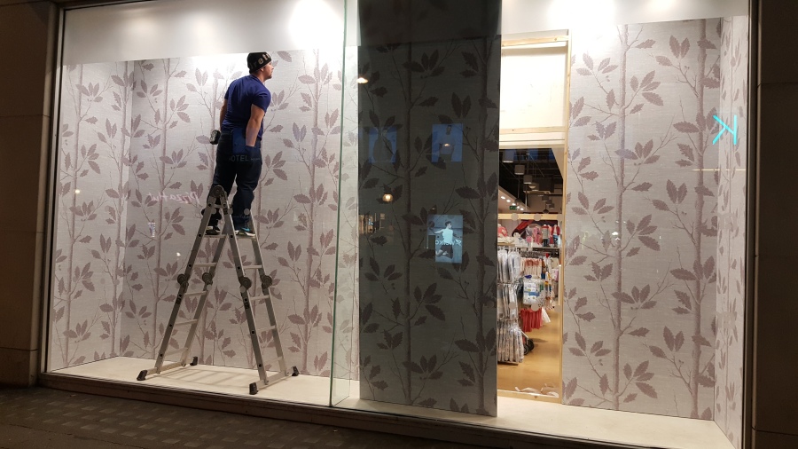
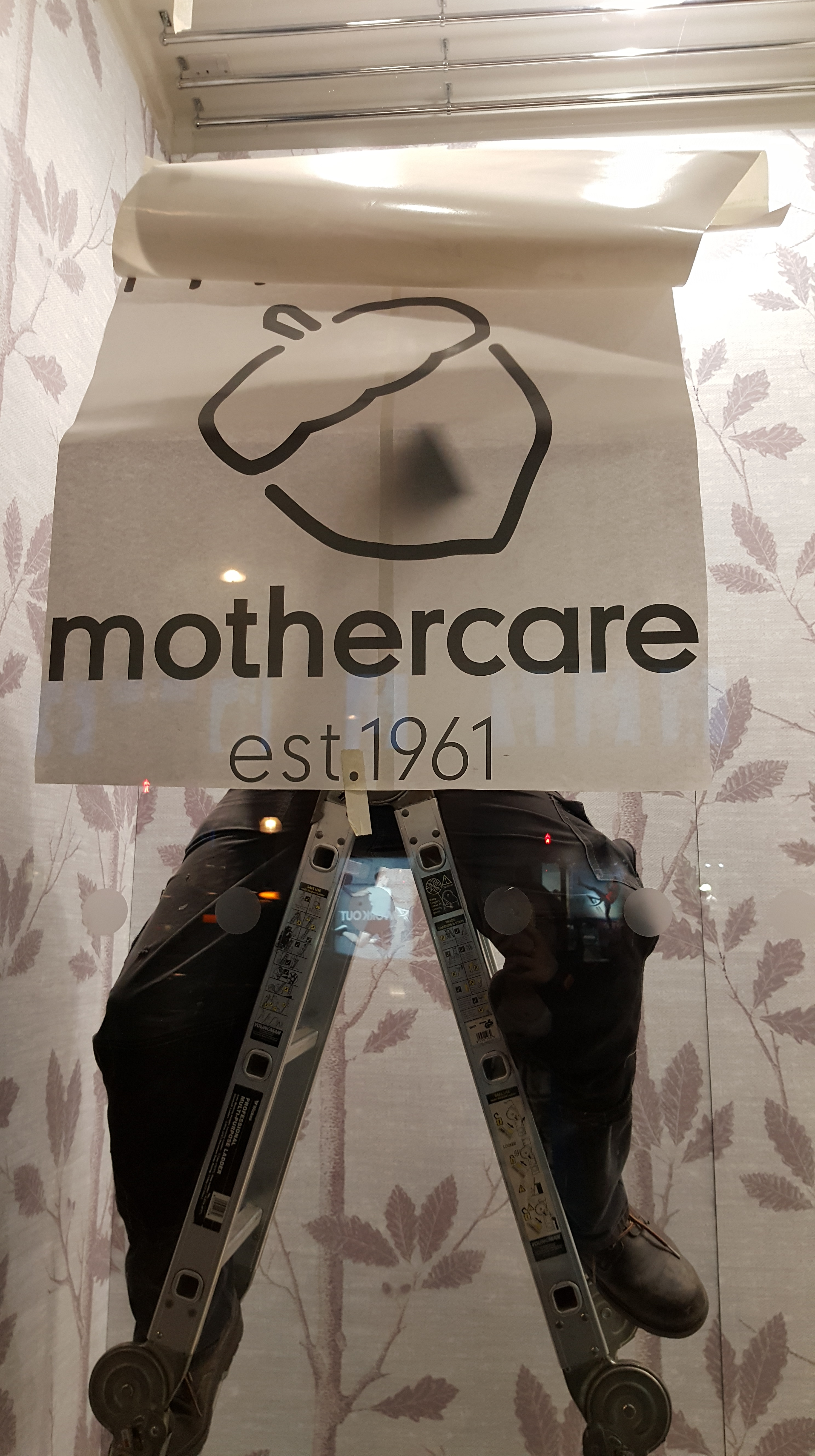
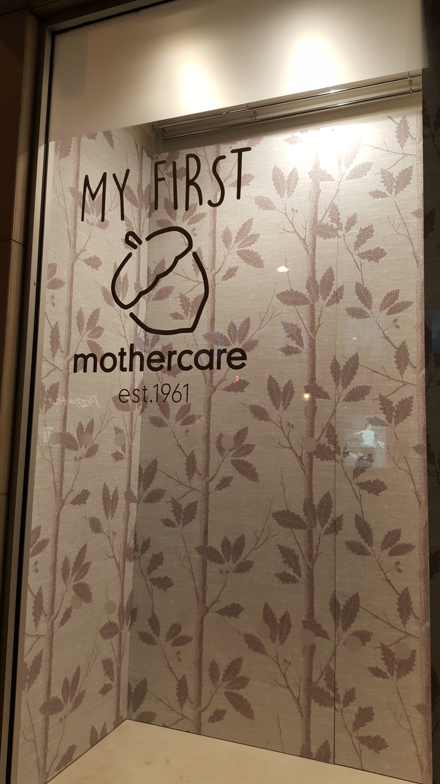
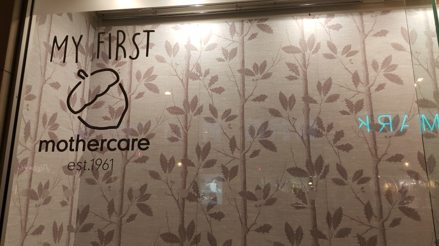
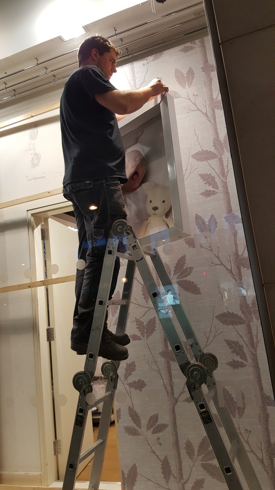
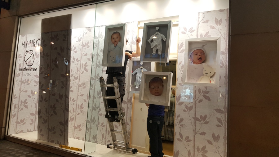
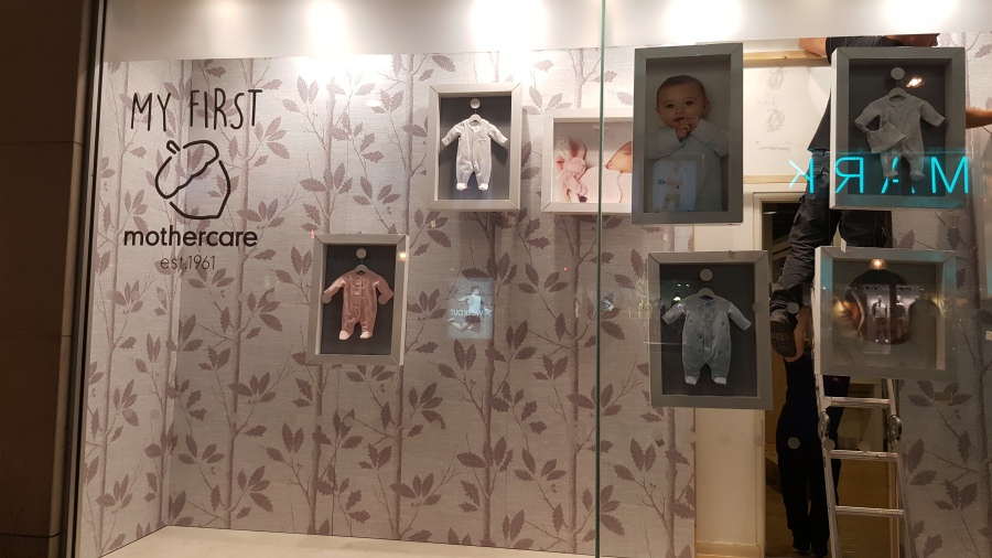
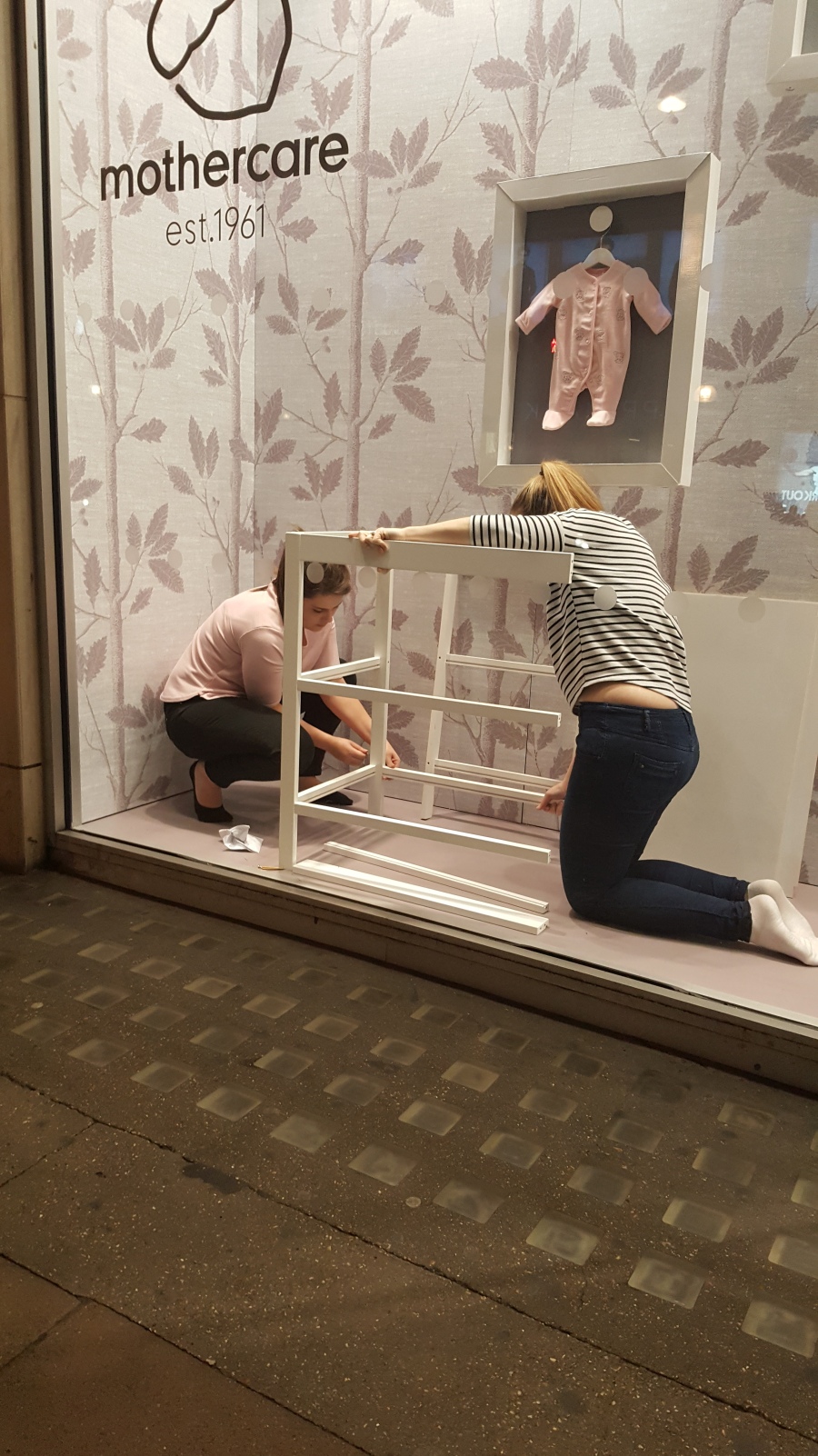
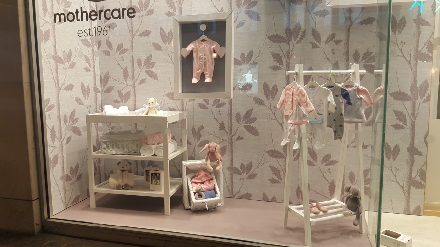
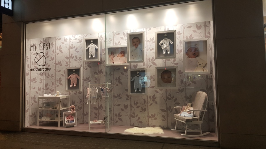
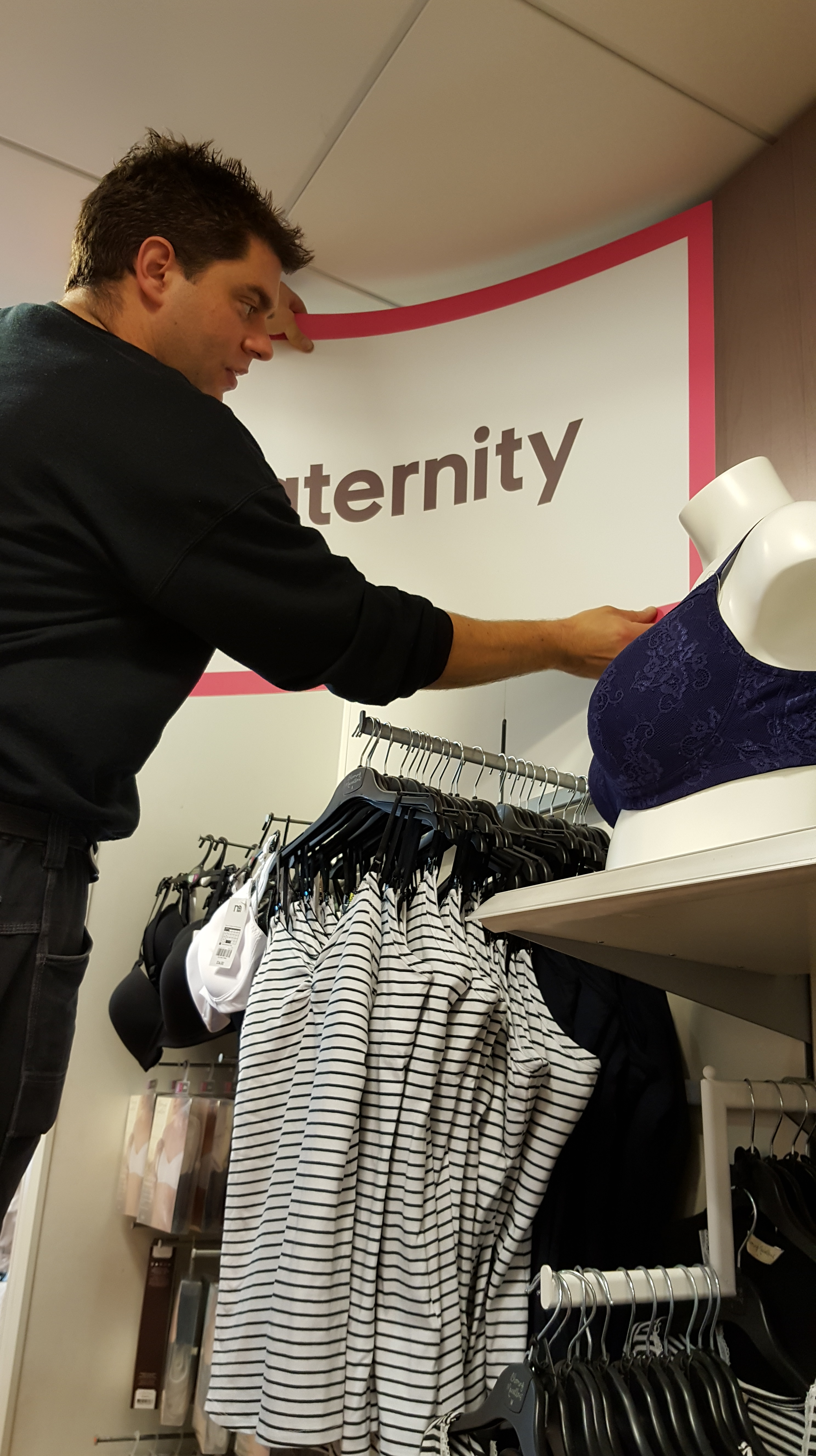
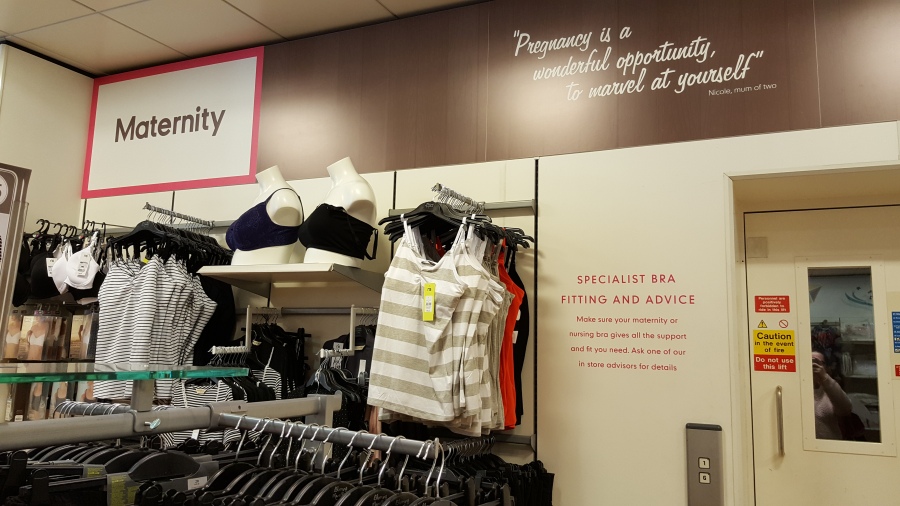
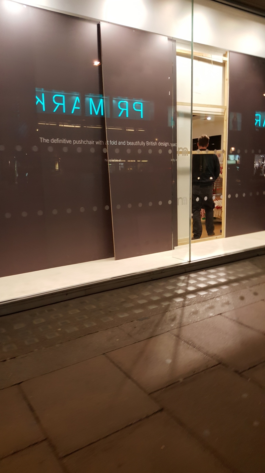
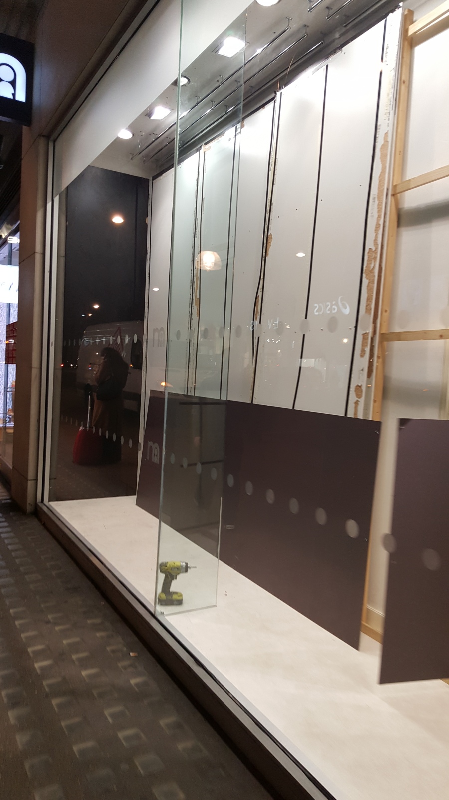
They have some really big contracts with shops like Mothercare, and companies like Reed. They do a lot of shop windows in Oxford Street for some big names. A lot of people come to them for things like office equipment, and signs for their windows or frosted glass. They also cover all the car vinyls for a lot of driving schools; an example is Blue School of Motoring. They use Adobe Illustrator as their main software for doing everything on.

SS page

The type of organisation that Smart Signs is a Sign & Graphics company.

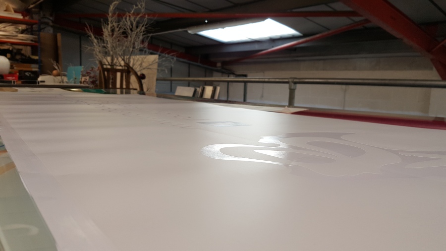
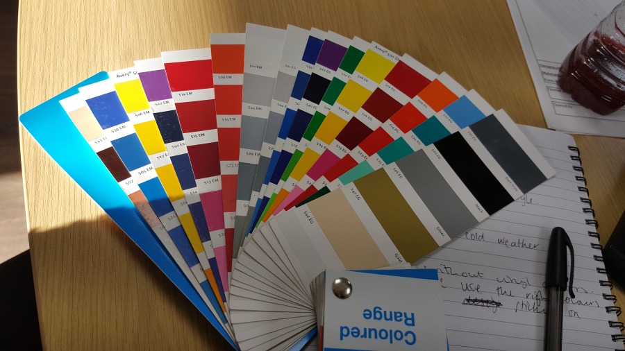
Some of the equipment there is very big and can be difficult to use, such as a laminator, industrial guillotine, vinyl cutter, and flat letter cutters.

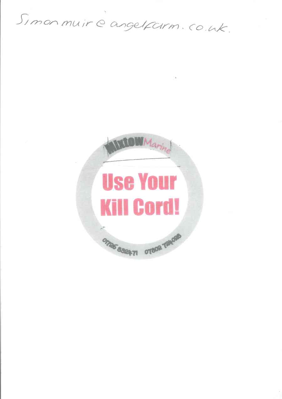
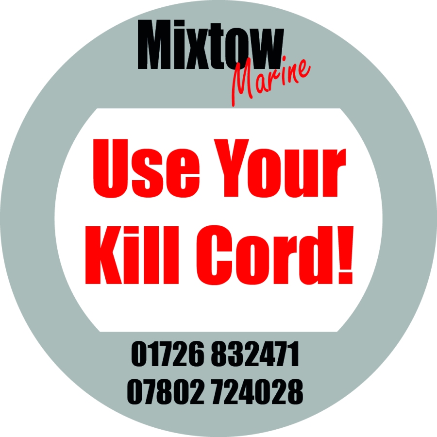
A man came in about a previous piece of design done by the company and asked for it to be reworked into, so I was given the task of doing so to meet the client’s expectations. I changed the text to match the logo of the company as the design that was previously done did not match it at all. It was for a round sticker and they wanted to logo on the top of the circle and the telephone numbers in a clearer text on the bottom.

Before:

scan0001.jpg

Amy’s Design:

scan0002.jpg

My design:

kill your cord v4

I was shown how to use the industrial guillotine and all the safety precautions before you are supposed to use it. You cannot cut your fingers off because the machine does not work unless the cover is closed.

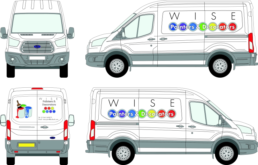
Kim wanted to see what my Adobe skills were like so she asked me to design a vinyl for a van on a preloaded van template that they have on their system, based on a labour company, so building, painting, decorator, carpenter etc. I used Futura Light as my font and used some of their clip arts to make the logo up and added an email, and contact telephone number on the back. Kim was really happy with it and thought it was great that I designed it so quickly. James was in a meeting at the time so when he came back I showed him my van design and he was really pleased with it and was also impressed on how quickly I came up with the concepts.

Painter & Decorator van.jpg

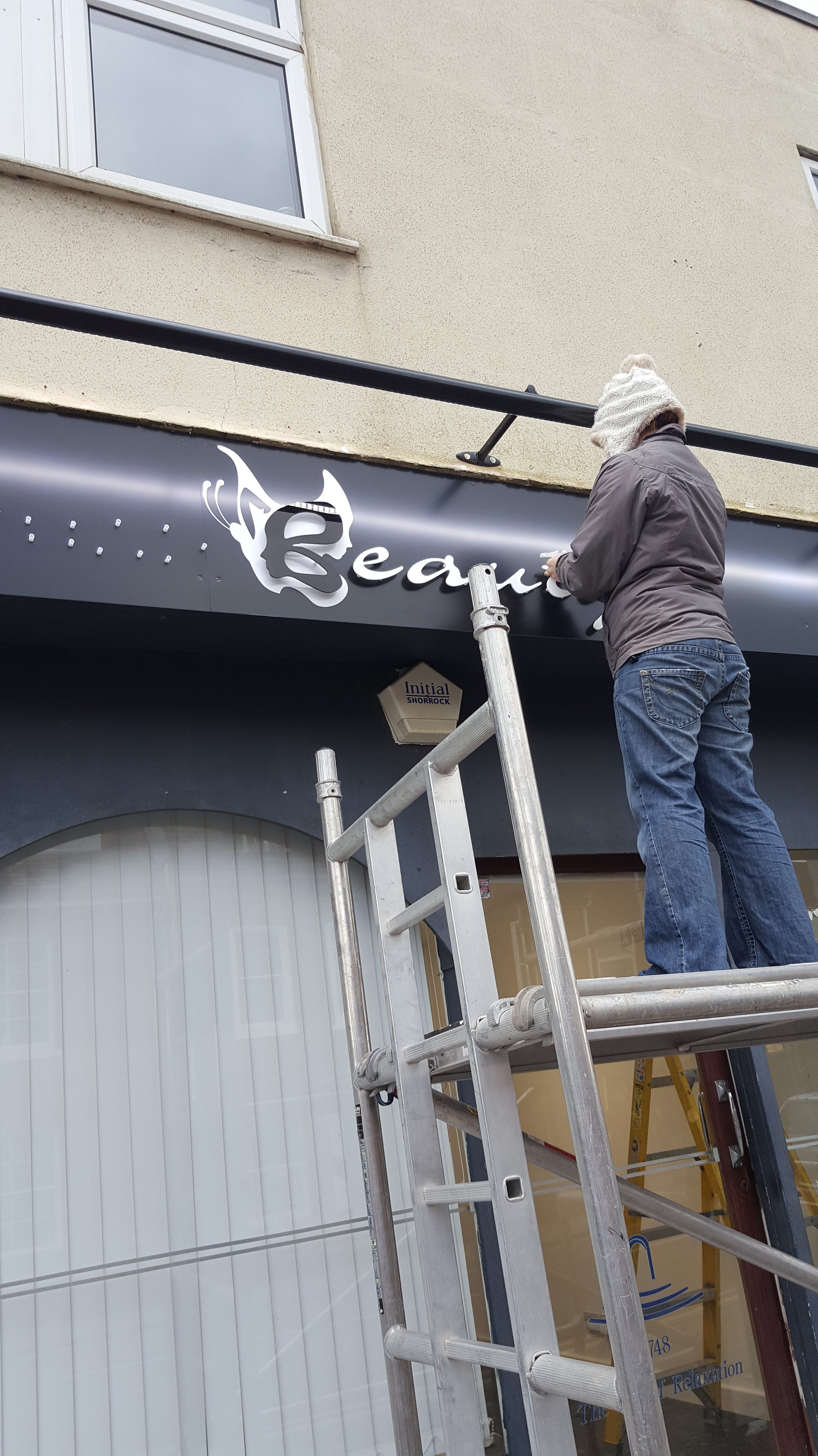
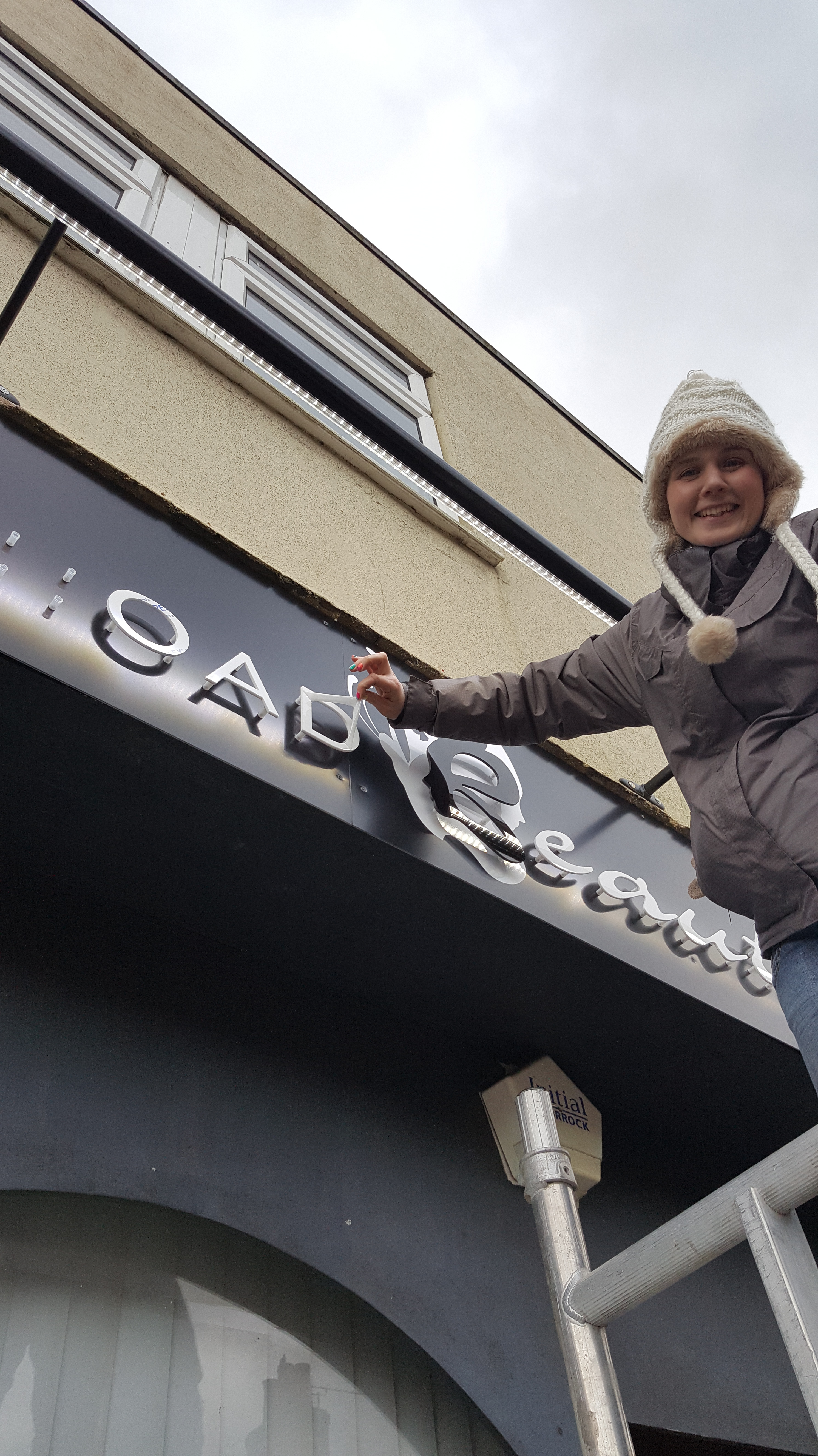
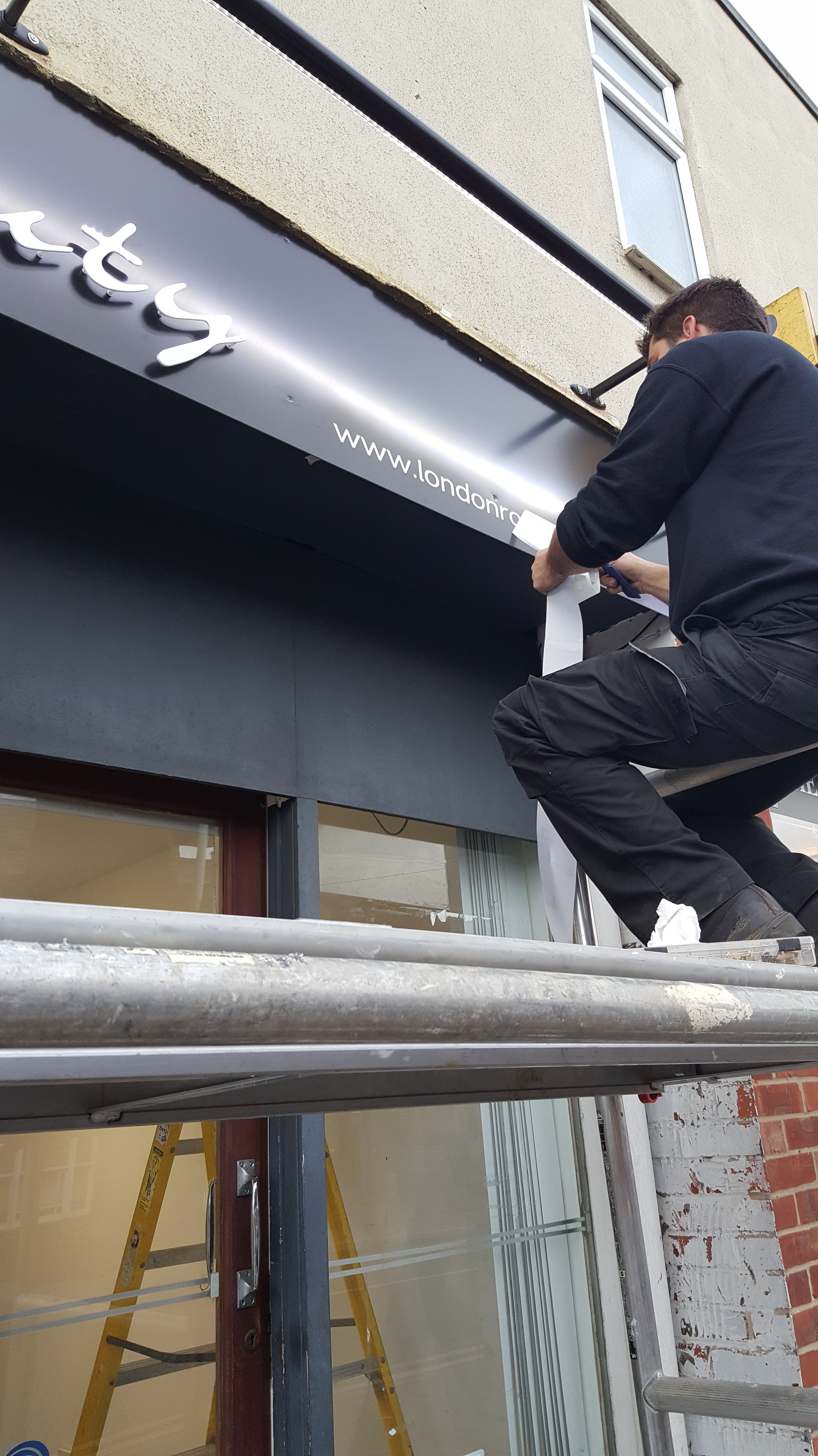
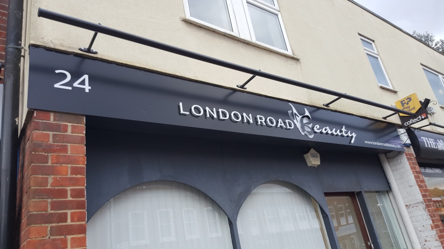
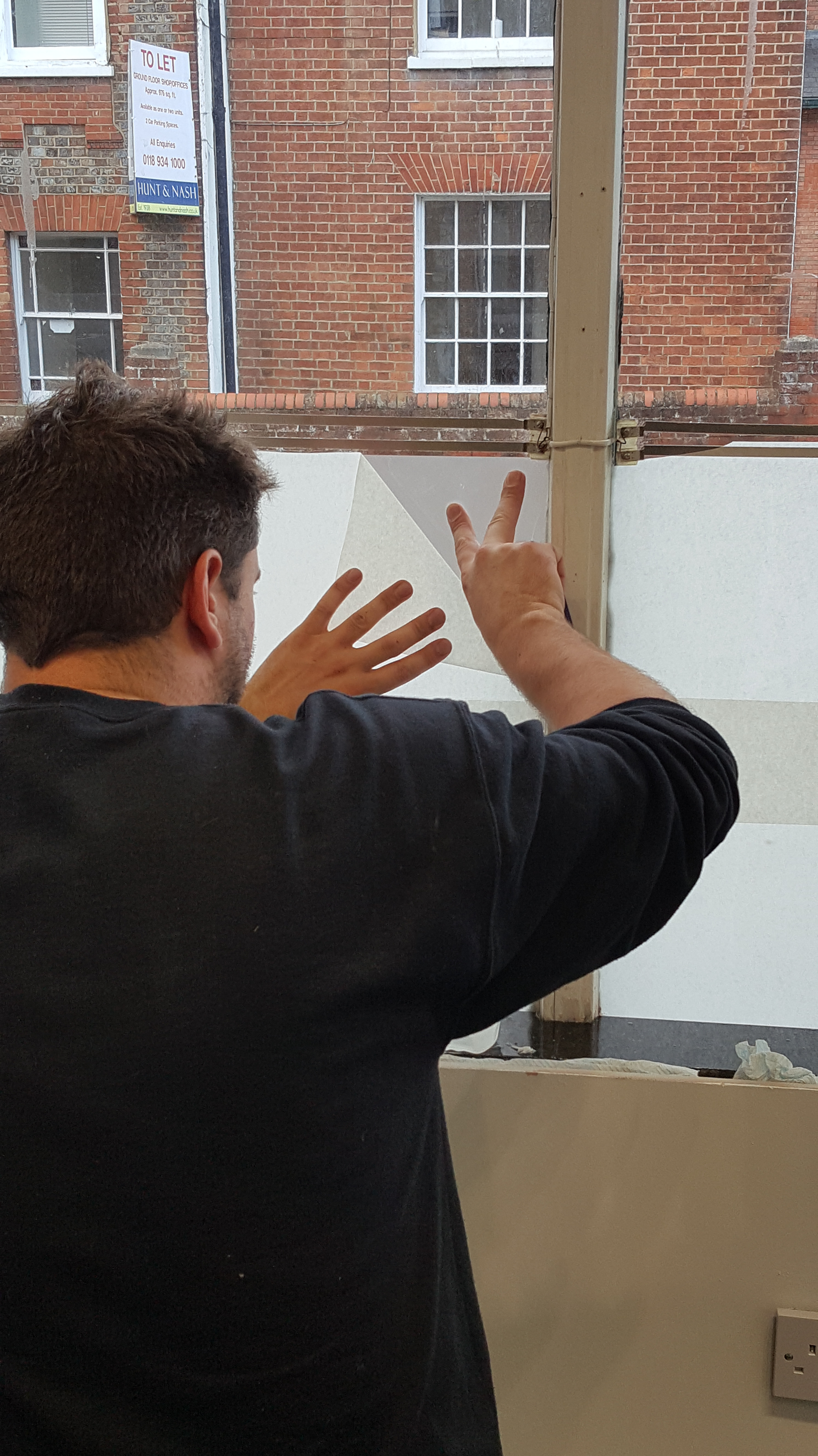
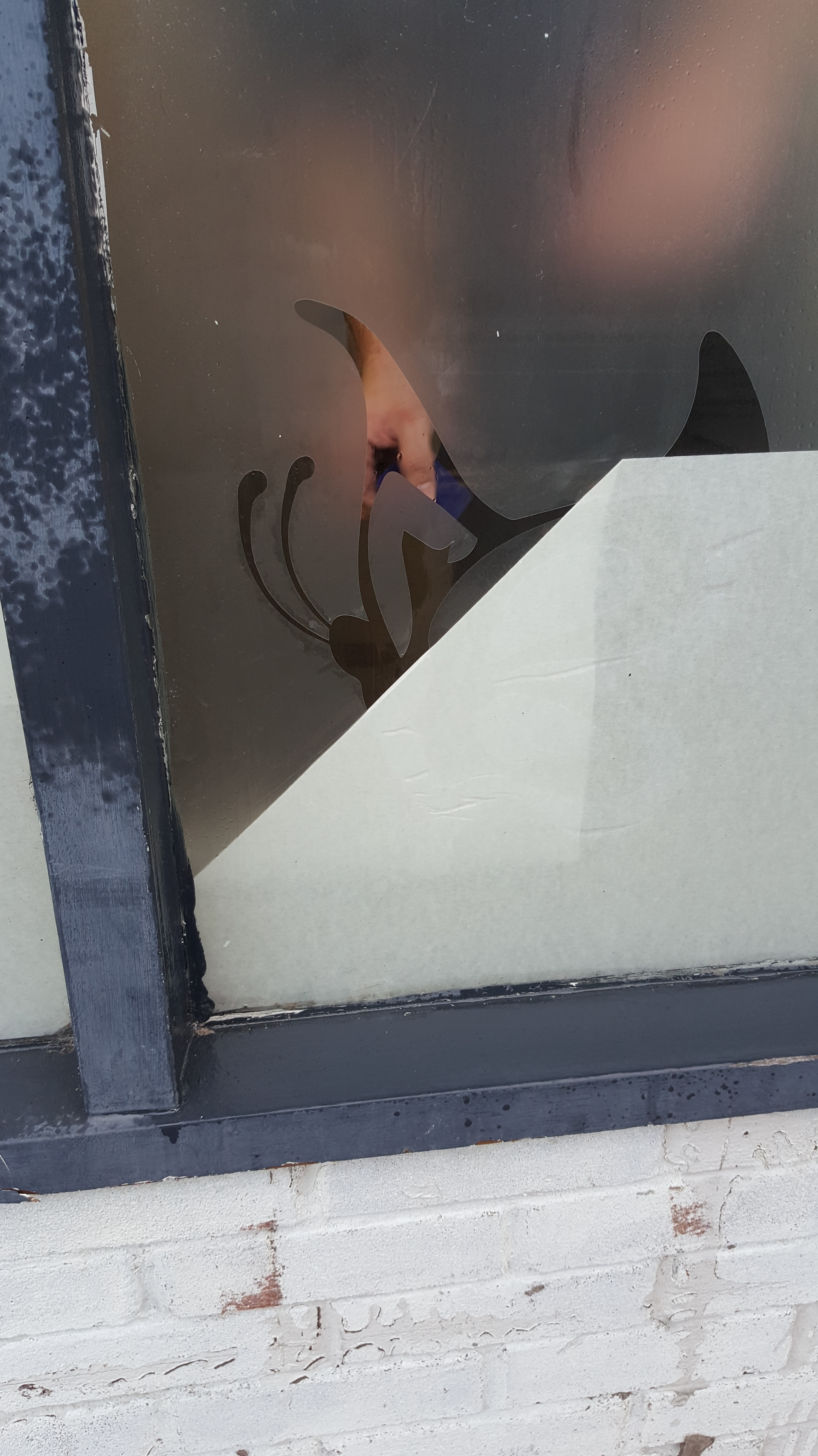
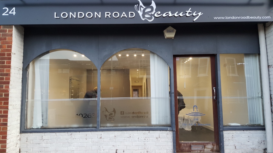
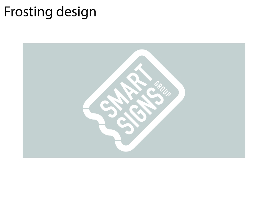
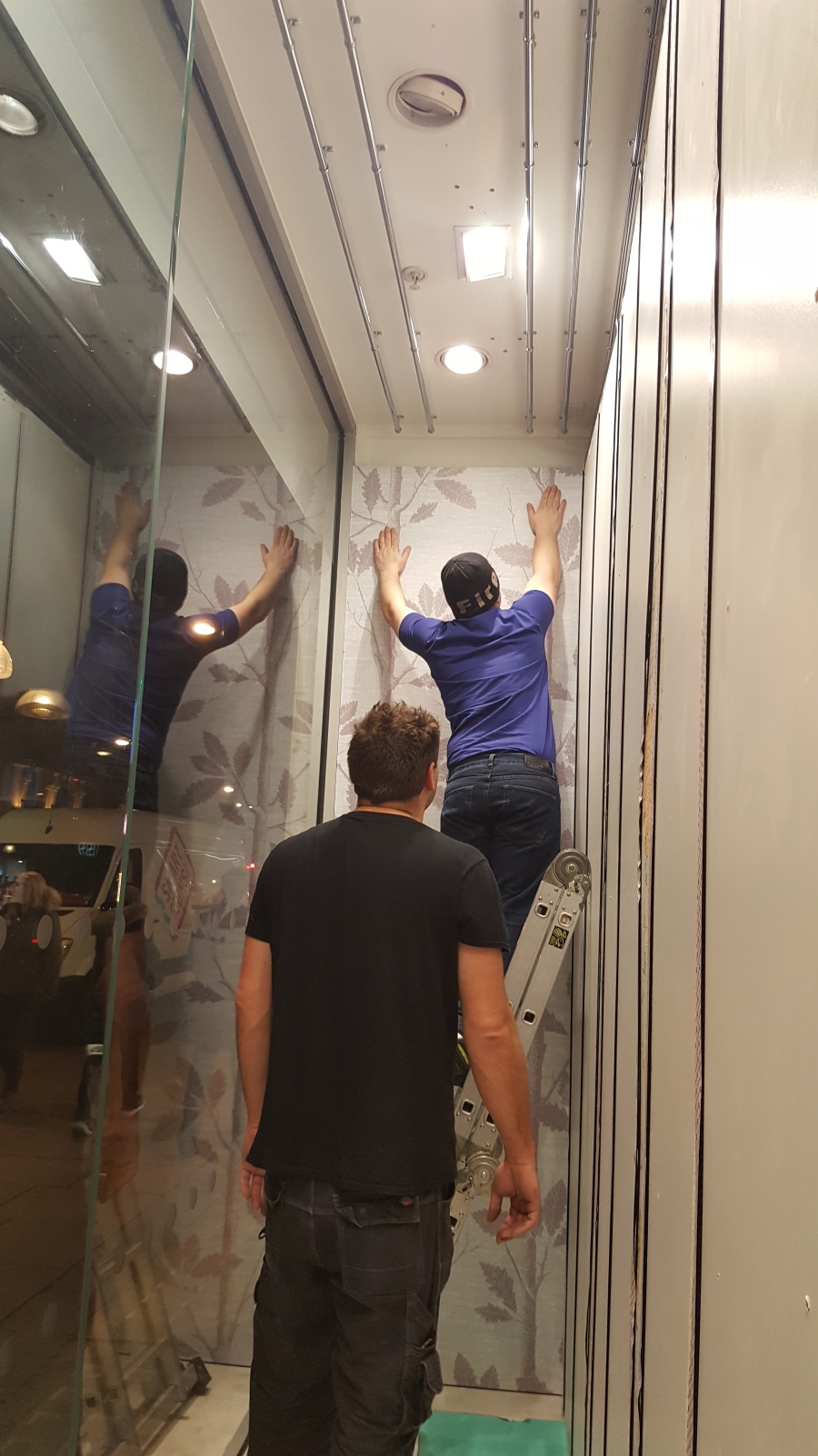
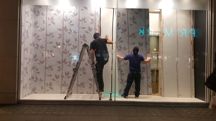
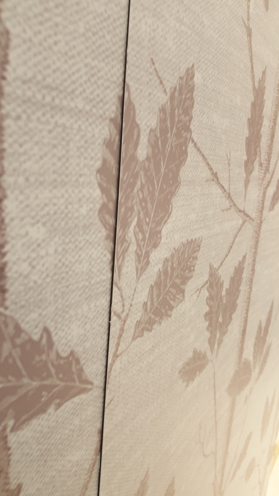
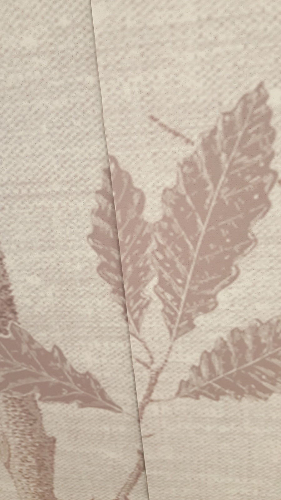
I went upstairs with Val and we looked at how to make frosted glass wrapping for a Reed shop front in Staines. We used Illustrator to create the boxes the right size for the window and programmed it to the “Summa Cutter” which would outline the boxes on special paper so that we could then peel off the frosted parts and place it on the window.

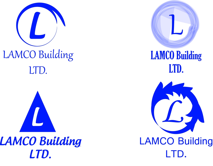
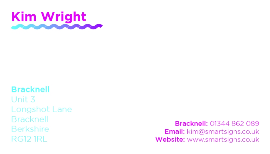
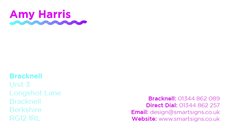
James also tasked me with redesigning his business card because he didn’t like his one.He thought is was too big and the squiggly line underneath his name wasn’t straight. My advice to him was to make the text smaller and put the address on the other side so that it isn’t with the logo. I came up with four different designs for him and he said he liked the fourth one best so now that is his new business card.

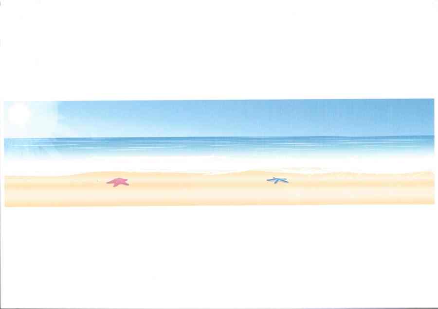
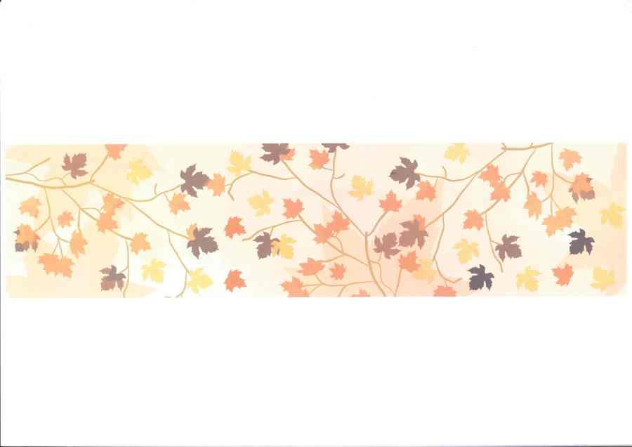
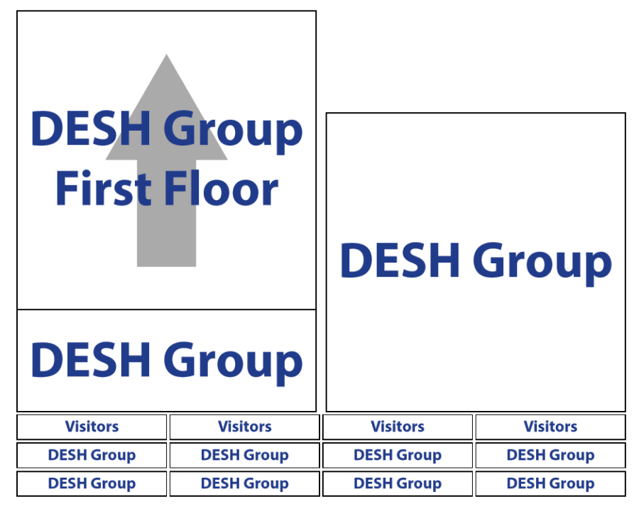
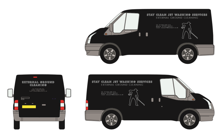
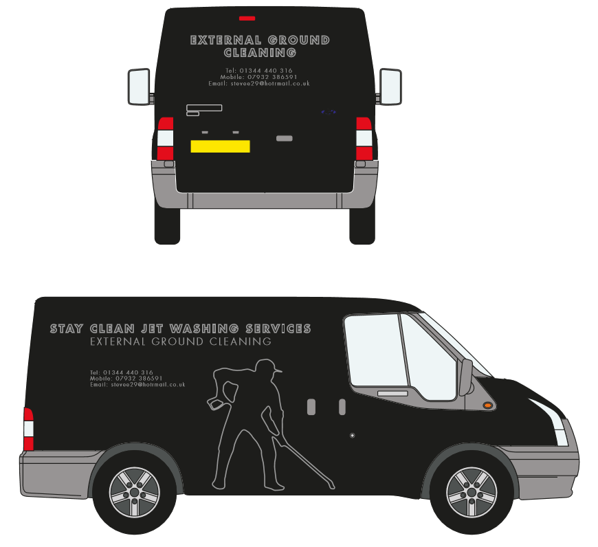
A group of men came in and asked for a design for their company which they wanted to be called “Stay Clean Jet Washing Services” and reiterated that it would be for external floor cleaning. They left their mobile, office, and email information with us and James asked me to have a go and come up with some designs for them. I came up with 4 concepts and made it unique. It was for a black transit van and they wanted to use either white or grey for their vinyls so I chose to stick with those colours. Within 20 minutes I came up with the four concepts, and yet again, James and Kim were pleased that I designed them so quick.
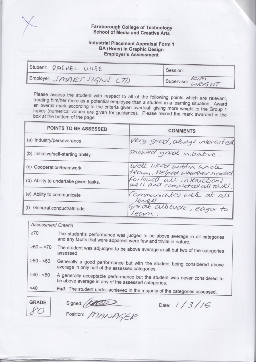
vanvan2

Arranging Placement

After I finally managed to get hold of Smart Signs, we arranged a date for me to go in and discuss which days would be best for me to come in and complete my placement with them. I chose to come in for Tuesdays and Thursdays for five weeks so that I would complete ten days over a long period of time. This would benefit me because I would be able to see some projects through from start to finish. It wasn’t a very formal meeting, it was more of a come in and have a chat type meeting. I did not have to provide any CV, cover letter, or fill out any application forms. However I do have a CV that I could have given out, as well as a cover letter.

CV

Cover Letter.jpg

I also have a business card that I could have given them, or attached to an email, but I didn’t see the point in doing so as they had already agreed to take me on, rather than consider it over a period of time.

Rachel Business Card-01Rachel Business Card-02

More Emails

Having some difficulties over the Christmas break, I contacted a design company called Smart Signs, located in Bracknell. They were previously called TTC signs, and they provide a wide range of services available to anyone. This is their website.

They provide van and car graphics, shopfront signs, window graphics, commercial signs, banners, and many more. I contacted James Graves, one of the main Graphic Designers of the company and he forwarded my emails when I eventually managed to get a reply after Christmas to Kim Wright, someone who would be able to help me more with the placement process while James is busy.