Hamburger Menu – Java Script (Lesson Notes)

Flex nav is a hamburger menu Jquery website. Download the zip file from github / flexnav

On the website, it tells you to name the navigation – we hold it in a list in Dreamweaver, just give it an extra class (flexnav) and also something called data-breakpoint. Java script uses this attribute.

The script recognises that it is our navigation.

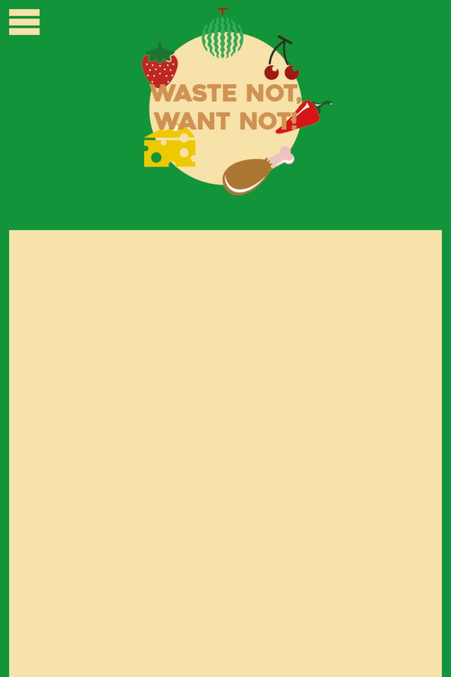
“menu-button” is the hamburger button. once this is all done, we need to start linking the css and the js files.

menu stuff.png

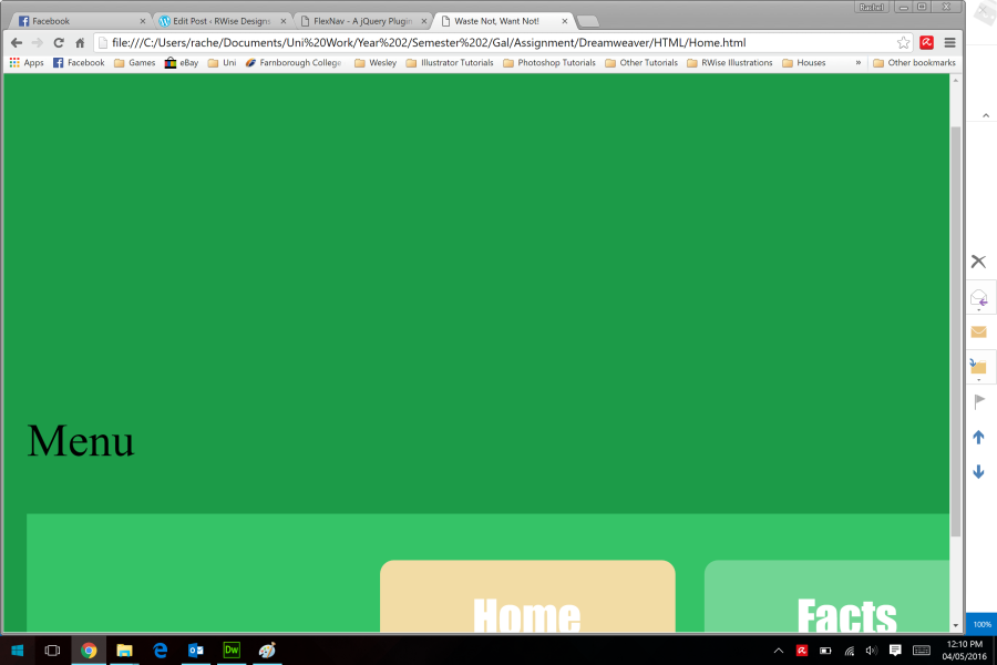
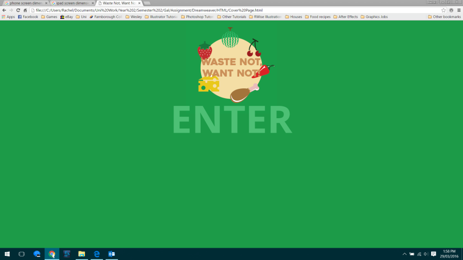
Didn’t work, no button, not clickable. Why?

We put java script in by using script tags. They are type tags, but we havent put anything in the middle, we just put a source file in which lives inside that tag. There is no content, we will put content in when we initialise it.

By adding script tags we can make the code see that it is js and we need to.

Go to Google to find Jquery CDN (content delivery network) and copy and paste the Jquery link for the js to communicate to its Jquery server.

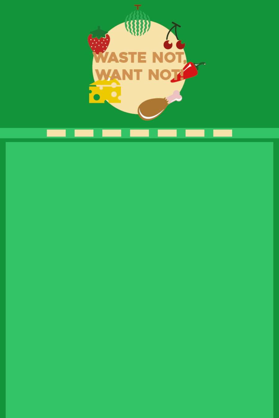
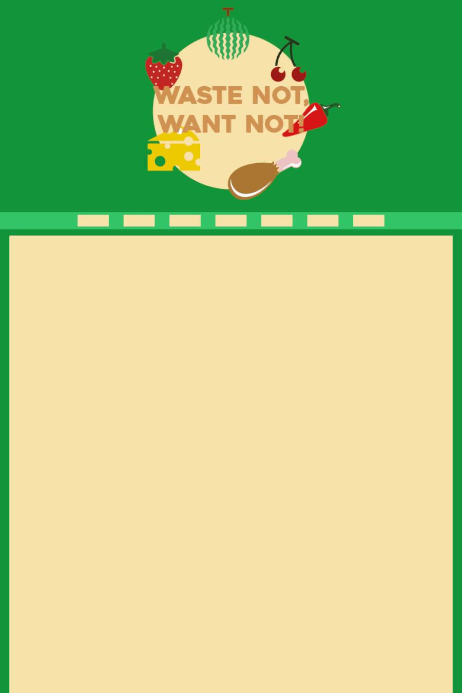
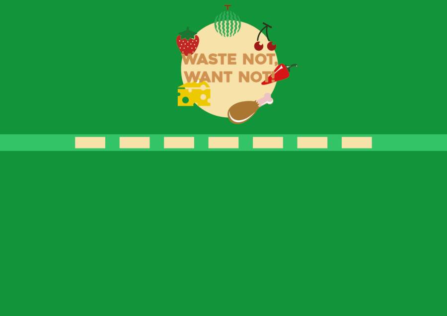
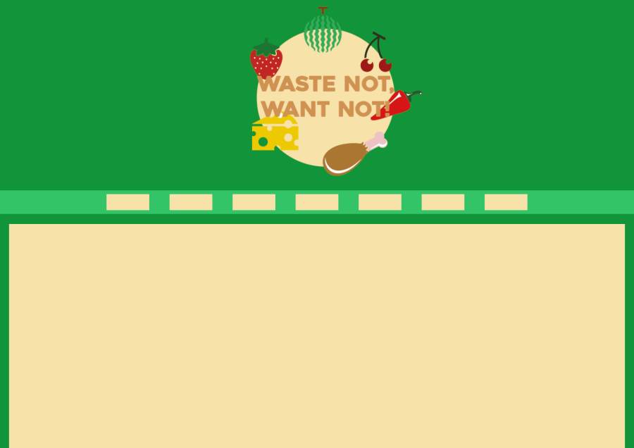
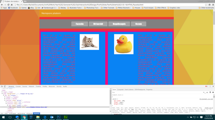
Now I want to style it because it looks horrible and doesn’t match the colour scheme.


menu 2.png

I want all of the tabs to move across the page, so for styling we need to target the list items. By going to main CSS and scrolling to the media queries, notice that we set it to 800 so when we put the data attribute in, it was the same thing. If you want to change it for navigation only, you need to go to the list to do it.


Media Queries

Google material design shows us the device metrics for a wide range of devices. How would you know which one to work with? Well, they’re all in alphabetical order ranging from Asus, Dell, HTC, which are all Android, as well as LG, Motorola, and even Google phones and Samsung. You can find a lot of different devices on this list.

There are also things by Apple, like the watch, iPad, iPad Mini, and so on. Each one is different when you look at screen dimensions and aspect ratio. For example, the old iPhone’s aspect ratio is 2:3 and the new one is 16:9.

Most Android devices, and mobile phones in general, are 360×640.

These are good numbers to keep in mind but what we really want is to take our site and minimise it, and when we think we need a break, we put it in.

@media = change size of screen for different devices.

If we start with the phone, we look the minimum width of the device, but as we started with the desktop we’re going down in size, checking for the maximum width because we started with highest size.

/*responsive*/

@media(max-width:800px){

***

}

Media query – any rule we put will be in the media query. All the stuff for 800px and down is going to go in here ***

The next thing we have to think about is what do we actually want to change? If we have two articles that are next to each other at desktop size, we want them to go underneath each other when the screen size is reduced.


Page Designs: Mobile

8910

These are the mobile designs for my site. I was thinking about keeping the navigation the same as the desktop and tablet sizes because of easy navigation through the page. However, most mobile sites as I have seen in my research, have a hamburger menu which condenses down the navigation bar to a handy side menu that you can click wherever you are on the page. I am going to take this into consideration when it comes to building my site for different platforms, and even within the desktop site so that when you change the screen size, you get to see the hamburger menu.

Page Designs: Desktop 2

567

This is the second group of designs for the desktop which include my logo. I really like these better than the other ones because there is more of a scheme to it. The colours in the logo make it easier to get a consistent colour scheme. I can match colours that are in the logo to colours that I would like to see on the page. This could make the page look more professional and it would also show that the design has been taken into consideration.

Display & Developer Tools

There are two ways that you can lay a page out, and these are by using floating and the inline-block display rule. Both ways are good, one uses display and one uses floating.

By using CSS we can make a box model which helps us see how a page is laid out. You can look at any website by using the developer tools in a browser.

What are developer tools?

All browsers have it, Microsoft Edge, Firefox, Chrome, Safari; but what are they? You cannot do web design without it. If we see something on a site and we want to find out what it is, then we can find out what it is by using these tools.

If we look at our site, we can right click on an element and click on inspect and it would come up with a little window at the bottom of the web page with the HTML on one side with the element highlighted and the relevant CSS on the other side.

1.png

We see rules for the elements and we can check and uncheck different things in the CSS that we do and don’t like and to see the changes and see with or without.

Developer tools are very useful and it can be a little more complicated. You can hover over an element of a page to see what each element contains in HTML and CSS. If we click on article, we get other things, like from the article CSS and our classes for the paragraphs in the article. We can add stuff and uncheck any stuff that we change to get a feel for what we’re doing right or wrong.

2.png

Anything you change in the browser developer tools, will not stay.

http://www.apple.com/watch/

If we bring up the developer tools and click on the plus in the corner, we can add a new rule. To create the box model in CSS we want to put a border in so we can see all the elements. So type *{border:solid 1px red;}.

* means everything.

This lets us see what elements are on the Apple page.

3.png

Research: Fifth Website – Topshop

http://www.topshop.com/?geoip=home

After looking at the M&S website and seeing how well it worked across all the devices, I wanted to see how other shopping website worked across different platforms so I decided to look at Topshop.

Desktop:

1

2

Mobile:

Tablet:

When looking at the M&S website I wondered if all shopping sites were the same across different platforms. They are very similar in terms of design because of the navigation. The navigation gets squished down into a hamburger icon and pops up across the side of the page so that you can still see everything on the menu and everything that the page has to offer.

Research: Fourth Website – M&S

http://www.marksandspencer.com/

I chose to look at the M&S website because most shopping sites are designed for different platforms really well. I will look into some other shopping websites too to see if they are similar in the way in which they are designed for different platforms.

Desktop:

Mobile:

Tablet:

Across all of the devices, the website works perfectly. Some of the images load a little slower but I think that this is down to whether the device is connected to Wi-Fi or using mobile data. If the user is connected to the internet using their mobile data then the device is working harder to get the image downloaded and visible to the user. The website is easy to navigate around when looking for certain products. You can still pick a category to view and filter as many products as you can so it definitely works well across all devices.

Research: Third Website – Sky

https://www.sky.com/

I chose to look at the website for Sky because they have a very long scrolling page with different sections on it.

This makes the page more appealing to people because as you scroll down you get to see different genres of things and different offers that may suit the individual user.

Desktop:

Mobile:

Tablet:

The difference between devices for Sky is that they have the same content, but just reduced in size. This is because some of the images and videos that they use for the desktop site are too demanding for the mobile site. A short video plays on the desktop site when you enter the page, if the video played on mobile devices, the users mobile data would be eaten instantly because it’s such a demanding site. They put videos on sites on desktops to autoplay because typically you would be connected to Wi-Fi and not using cellular data.