Assignment

The assignment task for this module was to design and build a website for a service. This service could be a search engine, an existing company or service, or I could think of a new company or service and start from scratch which would be harder. For the page, I would need a logo identity and the content, which would be things like the location of the service or company if applicable, a little general information about the service or company, any example work, and how to contact them.

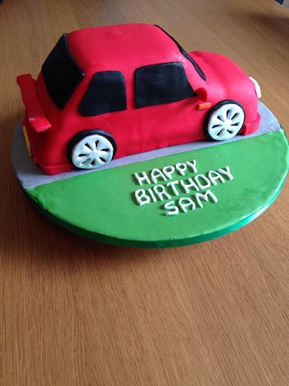
The website was to be around 5 pages and would have to have the same content as the company or service on their page. I chose a Facebook page called Kat’s Cakes, and she is a baker based in Sussex who makes amazing looking cakes.

I started by researching into what other cake websites looked like for layout ideas, and then started taking the information from the page that I would need for my redesigned site. Here are some screenshot of a website that I found called Charm City Cakes.

ass1

ass2

ass4

ass3

I like this website because of the colours and the layout. It is laid out evenly and looks really well presented. I like the way the navigation is spread out and the spacing between each button makes things more legible. When you hover over a navigation button the word changes to an icon. I like this because it shows the site is responsive to the users’ actions. It responds to the user hovering over the bar. They have a really well laid out gallery of all their images of all their products. It shows their company well with a good number of spaces to place images without the user having to click each one. Their contact page is very useful because they have an interactive map section where you can zoom in and out and see how far away their shop is from wherever you are. They also have a range of different ways you can contact them.

I then pulled some images off of the Facebook website and then added the information on to it.

1016943_544713599006763_370514225836696026_n

10552499_506757912802332_8050809843005444798_n

imageload

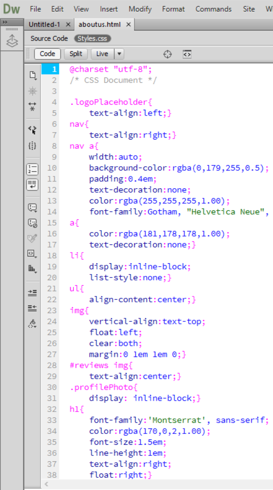
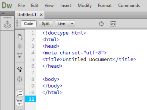
I then spent a lot of time in Dreamweaver trying to make a site that looked professional. Unfortunately, HTML got the better of me and confused me a lot so I didn’t get very complicated with the coding, but for a first time coder, it didn’t look all that bad when it was finished.

1d

1b

1c

1a

Responsive Web Design

Responsive web design is a site that responds to the platform you are viewing it on. An example of this is www.smashingmagazine.com because you can resize the window and still see the content, depending on which size you get down to.

kjhgfdz

oiuygft

You can see on this site that when you resize the window the layout of the page moves so that you can still see the majority of the content on the small screens.

On mobile sites you can rotate the screen to either portrait or landscape. You would look at a webpage on a desktop or laptop at landscape orientation, and you can also zoom in and out on mobile devices. Depending on the OS, the browser defaults will be different and the website may be seen differently on different devices, the same as when we view the same site in different browsers on a desktop or laptop.

Basic Tags

A style sheet belongs to the browser, each browser has a different one.

kjh.png

You can see on one side is the HTML for the eBay page, and one side is CSS. When it comes to writing the CSS styles you have to use certain brackets otherwise it wont work.

uytgh

Style tags use curly brackets ({ }), whereas the element tags use the less than and more than signs (< >). When you write a rule, you are talking to the tags; for example

<style>

               Body{

                           Background-color:rgba(51,153,255,1);

Colour and centre have to be spelled the American way otherwise they will not work and there shouldn’t be any spaces between the characters.

Background-color:rgba = Behind type/main page

Color:rgba = Text

Font-family = Change text

Font-size

Text-align:center/left/right

<style> = Change colors/sizes/fonts etc.

<p> = Paragraph

<h1> = Heading (1 to 6 based on importance)

You MUST close brackets when finished

  • <p> </p>
  • <style> </style>
  • <h1> </h1>

In rgba codes: (51, 153, 255, 1)

  • The first number is Red
  • The second number is Green
  • The third number is Blue
  • The forth number is the opacity

Adobe Dreamweaver

Dreamweaver is the application that you use to make websites, and code sites.

1

Row 1 tells the browser that the code is HTML, and the file save type is now HTML.

Row 2 is the HTML tag. Most tags come in pairs, so an opening tag and a closing tag. <html> is the opening tag for the start of the coding and </html> is the closing tag so all coding after that does not count.

Row 3 is the head of the page so all information about the page is here and there are no other elements here.

The body includes everything else, so all the elements that will make up your website.

HTML is the structure behind the site, and the CSS is all about the looks and the layout and presentation of your site.

html

Introduction to Web

This module is about learning how to design for the web and make my own website. The internet and the world wide web is a network of computers that can interact with each other. This module will help me design for social media and applications for various devices:

  • Desktop
  • Mobile
  • Tablet
  • Apple watch

Responsive design brings everything together; examples of responsive design are sites like Behance, Tumblr, WordPress & Squarespace. These are all blah sites and other sites that display things that people post; i.e Facebook.

Loading pages on the web communicates with the server and browser to load all of the page. The server talks to the database, which holds a lot of information. There are two different types of content when it comes to web design; Dynamic content, and main content.

Dynamic content is content that the designer knows where the images and information will be on a page, but does not know what the image will be or what the text says.

Main content is the structure of the site, so the main window, sections, side bars, footer, and article.