Website Designs

I was in charge of designing the website using the other aspects of design that we have for the packaging and the logo. I put them together in Photoshop and sent them to the other team members for some feedback.

At first, the logo was white and green, which Gemma picked up on that it would get lost in the design because the background is quite light. So I changed it to a dark brown, which made it stand out a lot more.  These are the images for the desktop website.

Cover page 2

Contact us 2

Contact us one hover 2

Contact us hover 2

Products 2

products slide show 2

Baby club 2

where to buy 2

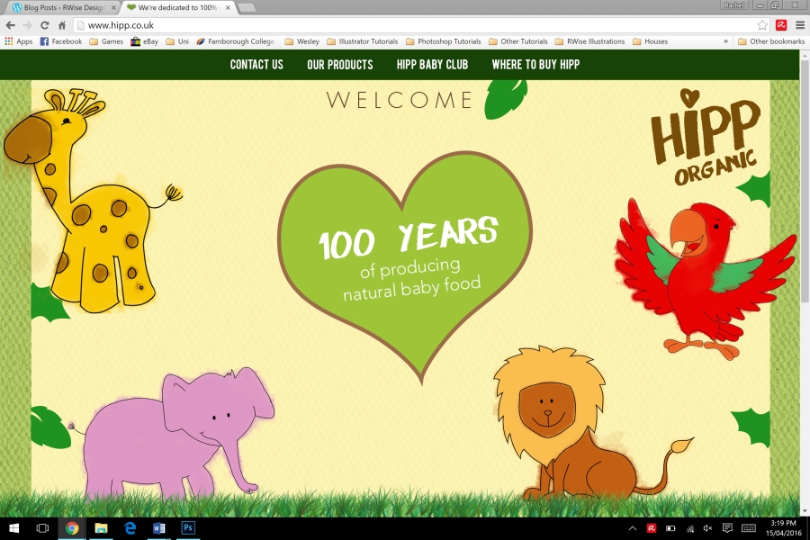
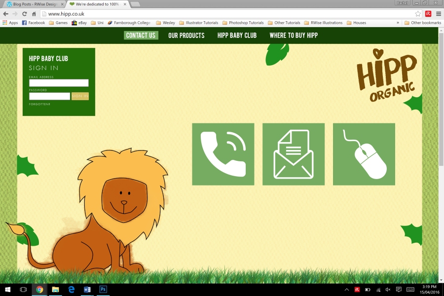
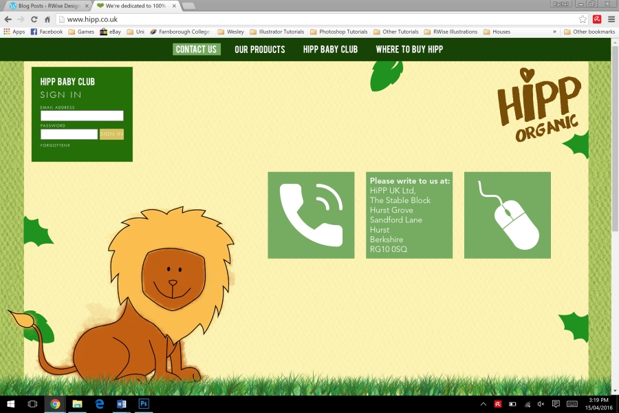
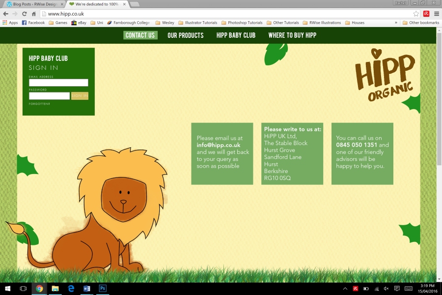
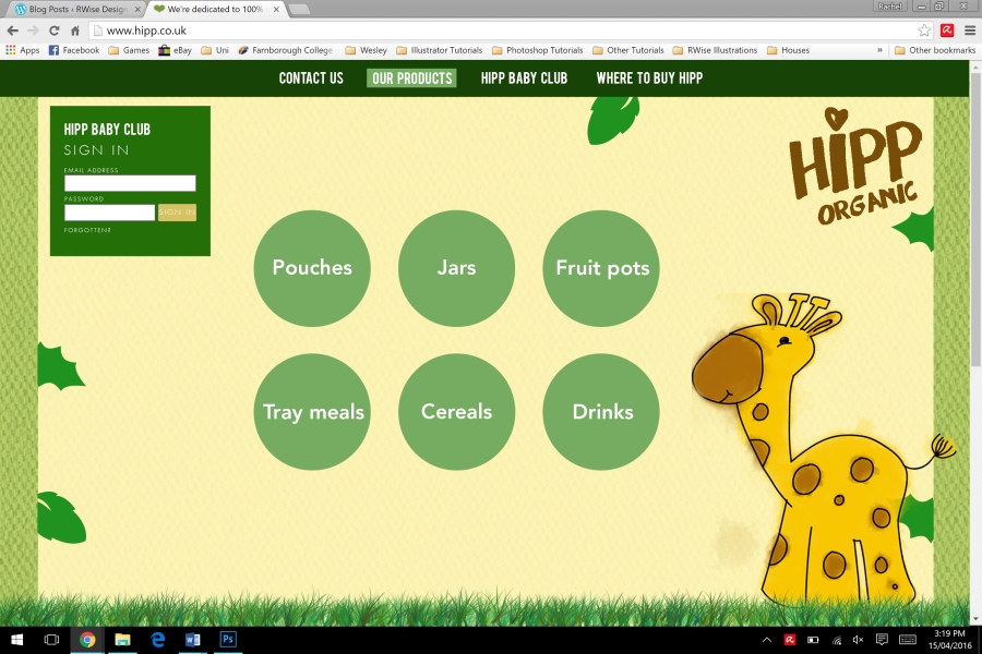
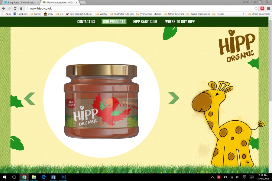
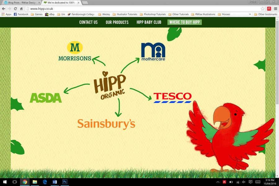
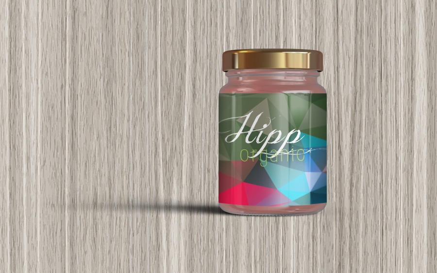
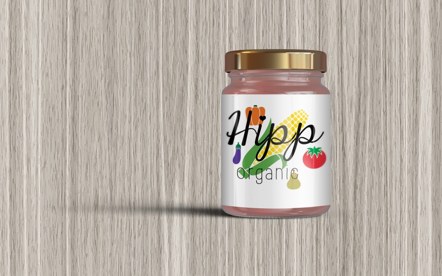
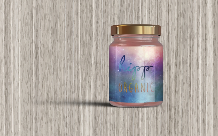
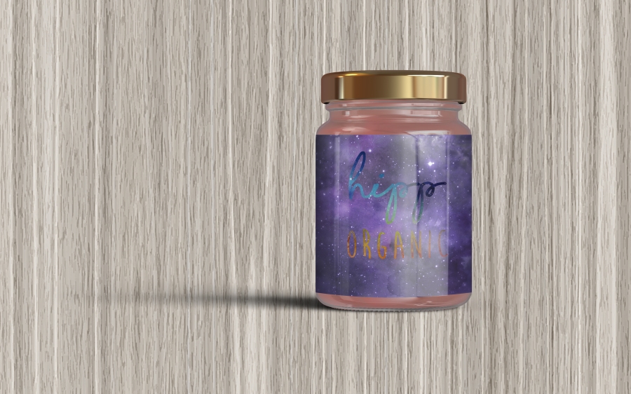
I tried to keep the colour scheme quite consistent because sometimes sites with an inconsistent colour scheme don’t piece together very well. The one thing that is different on each page is the animal. Instead of having all of the animals on the page, I decided to put one on each because it would be similar to the way we have done our packaging – one animal per flavour.

There are also some designs for mobile devices because we had to design for a range of platforms. I just simplified the pages and put a hamburger menu at the side – I think these designs work well because even though they are simplified they have all of the information on.

Collaborative Production Meeting

Today we had a meeting about the logo that we chose as a group on Wednesday (16th March) didn’t match the target audience that we were trying to pitch to. The target audience that Hipp Organic currently pitch to are younger mums who can afford cheap food, so aged about 21-25. When Flourish came in and had a talk with us, we said that we wanted to pitch to a slightly higher demographic so that we could raise the price of the product.

Something that Emily brought up in the meeting that we had, was that her market research was aimed at children, whereas mine and Gemma’s were aimed at mothers. She thought that this might be an issue but it’s not as people research different things so that we can decide on who we want to target.

We’ve decided that we are going to take the top two logos to nurseries so that we can show mums, and find out which mums like which logo better and go with the majority vote. By going to the target audience personally and saying which logo do you prefer, that gives us more of an idea as to which logo we need to put onto our packaging and so that we can start designing for other aspects of our brand.