Category: University Year 1
This is the first logo I ever made. I think it looks great because of the striking colours and it makes people look at it.
We had to come up with a creative way to display the different jobs in the creative industry, so I came up with the idea of making a periodic table but with the letters that the job begins with.


The text goes across a double page spread to the text continues onto the second page.
This module is all about self branding and making yourself known to the world through means of social media and design. I had to find someone in the design industry and ask them questions about how they work and manage their life at the same time and then had to illustrate my interview. I chose someone that works under the same company that I do, JD Wetherspoon, and they are the marketing director of the company. I also had to create a map of the creative industry and come up with my own logo and social media sites to brand myself.
I got a quick assignment brief for this module, and jumped into it straight away. I had to design for one of the following shops:
- Homeware
- Clothing
- Sports/bicycle
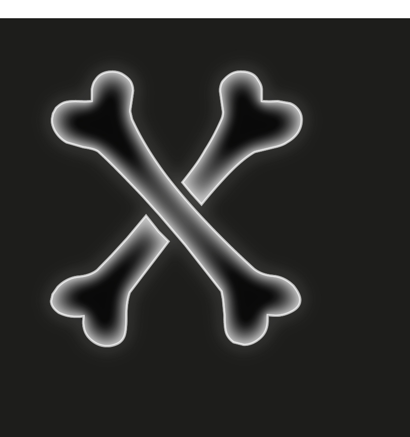
As well as create a 3D design for an A-Z installation to commemorate the home front at WWI. This part was a class project, but didn’t go to plan as our 3D printer wasn’t working at the time, so we didn’t get to complete it. But it short, Each class member got given two letters or numbers and had to create a stencil which illustrated a word about WWI that began with the same letter. Mine were really hard, I got given X and O.
For X, I chose X-Ray because x-rays were coming around at that time of year and they used the new found technology to try and find anything out about tuberculosis and other diseases.
For O, I chose officer as in the rank of officer in the ranks at WWI. This isn’t really about the home front, but was given the exception is it was quite a hard letter.

![o [Converted]](https://rwisedesigns.wordpress.com/wp-content/uploads/2016/01/o-converted.jpg?w=589&h=874)
I chose to design price tags, a gift card design, a shopping bag, and a sale poster for H&M as my design with materials part of the brief. I created a pattern and made it look really colourful and different to the current design for H&M and I think it looks really good as finished products.


Designing with materials is something that is in front of you, and not on the screen. So posters, wood works, packaging, etc. When it comes to designing with materials it could be for things like make up packaging, fashion, and even stenciling. When it comes to designing packaging you have to think about what it would look like, whether it would be patterned on the outside, what colour it would be, the size of the boxes, how it would be laid out on the inside and most importantly what it will be made out of.
The assignment for this project was a live competition brief about Save the Children. The aim was to inspire and motivate dads to read to their children for 10 minutes a day. I had to make sure I documented how I got to my conclusion and final campaign ideas. The children we had to aim it towards were the ones who were less off because children who read, or are read to, do better at school and go on to do better work. Children who aren’t read to or don’t read do not have as good results as they could have.
130,000 children leave Primary education not at the level they should be able to read at and 40% of those children are from poorer backgrounds.
1.5 million children will start Secondary school behind on simple reading skills
The way to getting dads to read to their children doesn’t have to be the classic story time and bed time. It could be anything, but someone has to be reading with them. It could be to support them when they could be stuck on words and how to pronunciation them, it could also be the definitions and explanations of a word or sentence. Children who read on their own tend to stay at the same level of reading, whereas with an adult reading with them, they are pushed to do more. It could be reading anything, from road signs to restaurant menus.
When it came to making my product, it’s all about how I created it, or could create it. It could have taken any form:
- Online
- Advert
- Video
- Infographic
- Experimental movement
It could display an emotion
- Sorrow
- Guilt
- Depressing as to the outcome of not reading
- Lack of interaction
- Big issue
It could emphasise that you don’t have to buy books, you could go to the local library to read books with your children.
The kind of audience this would be aimed at would be more towards the lower demographic than the higher.
Lower demographic
- C2, D, E
- Skilled working class
- Manual workers
- Working class
- Semi and unskilled manual workers
- Those at lowest level of income
- State pensioners, widows
- Skilled working class
- A, B, C1
- Upper middle class
- Middle class
- Lower middle class
The things I chose to make were a leaflet and a questionnaire to convince adults, mainly parents, that reading with a child is imperative to their learning ability and getting them somewhere in life.


Images:
- Crocodile tail
- Product
Colours
- Blue
- White
Language
- “Incredibly natural colours of your favourite clothes”
- Honest
The slogan links to the image of the crocodile tail on the shirt as the brand is Lacoste. Lacoste is a popular clothing brand, therefore linking the slogan to the clothes immediately by using the phrase “of your favourite clothes”.
The clothing used is a deep blue, which is a natural colour, again linking to the slogan “incredible natural colours”. The word natural is linking to the crocodile tail of the logo which has been made to look realistic.
Signifier
- The washing powder will make your clothes go back to its natural colour
- Too natural that the logo will jump right out at you
Signified
- Lacoste crocodile on the shirt
- Logo comes o life
- Incredibly natural
Denotation
- The washing powder will restore colour to your clothes so that it is like new
Connotation
- The colours in the clothes represent natural things, such as the ocean

Images
- Pie
- Pacman icon
- The E in Eat looks like a fork and a plug
Colours
- Iconography
- Pacman is yellow
- Text is white
- Pixels that he eats
Language
- Forward
- “Game on”
- Informative
Signifier
- Eat pie and play Pacman
- Eat food and play games
Signified
- Arcade games
- Compete against each other
The E in Eat looks like both a fork and an electrical plug head so there is different iconography within the text. The text being white and yellow on a blue background makes it stand out so that people will be more attracted to it because of the contrasting colours. The pie is the same shape as Pacman because a slice of the pie has been taken out, which is a good icon to use when attracting a particular audience because everyone knows Pacman. Having the informative text in a darker colour means that we have to look for it, and when we have looked for it, we want to know what it says.
