Placement

Today I went out with James & Kim to Mothercare in Guildford. I found it really interesting as I had been to the Oxford Street Mothercare previously, not only do they do the window displays for some of the stores, but they do the inside graphics too. I managed to help out and get some pictures at the same time. We had a very strict time limit to get so much done as there was no where to park a huge van for more than half an hour!

20160223_115032.jpg

The first thing we did took literally five minutes, as it was just peeling off some tape and sticking it to a wall. Job done. Simples.

The next part was the harder part as James had to take some signs down from the ceiling so that myself and Kim could take off the vinyl lettering, clean it down, and re-vinyl the signs.

Once we had done one, it wasn’t so hard to do the other.

20160223_131017.jpg

This was the most time consuming part, while myself and Kim were taking vinyl letters off and cleaning the signs down, James went around the store and put some new boards up at the front of the store and in the fitting room and changing room.

20160223_131111.jpg

The last things that were left to do was to put a view vinyls up and change one wooden patterned board to a board that said maternity.

20160223_131453.jpg

Not too shabby!

20160223_13334920160223_13232120160223_13370620160223_132337

And we’re all done for the day! I enjoyed going with them to Guildford because it was fun, as usual, but we worked hard to get the job even though we had very limited time (and an injured James)!

Placement Update

Nearing the end of my placement, I have started to write up my Production Report in InDesign. It seems to be going well as of yet, but I won’t be able to finish it until my final days are completed.

Untitled.png

I would be really sad to leave my placement as I have enjoyed it very much, but they cannot keep me on as there are no positions that I would be suitable for.

They are looking for a sign fitter at the moment, and as I am not qualified to be a sign fitter I could not fill that particular position.

Redesigned CV

I recently redesigned and updated my CV for when it comes to applying for design jobs. I have made it look really good in terms of the images and colours I have used. I used orange because it is really bright and striking, so when you see a CV that has a nice bit of colour on it, you are drawn to it. I also put my logo on it as well because it shows that I am capable of self-branding and reflects the skills I have listed on my CV.

This is what it used to looks like when I completed a module on self-branding and professional practice last year. (2015)

CV Page 1.jpg

This is what I updated it to yesterday. (14th Feb 2016)

CV.jpg

Summary Before Half Term

So for our Collaborative Production brief, we were to rebrand and research into Hipp Organic baby foods. As a group we have covered a wide range of facts about the brand and about the audience.

As the Project Manager of the group, I have tasked the other girls over the weeks with things to do that we could add to our research and make our brand even better by tailoring it very specifically to one or a range of audiences. By a range of audiences, I mean different demographics of mums. We could even create a brand that attracts all demographics of mums by finding out what all kinds of mums look for in a product like baby food.

Over the weeks since Flourish had given us our brief, I tasked Gemma, Emily, and Georgia with some light research into the brand and the shops that it is sold in. Emily had Asda and Sainsbury’s, Georgia had Co-Op, Gemma had M&S, Tesco, Mothercare, and Boots, and I had Morrison’s and Waitrose.

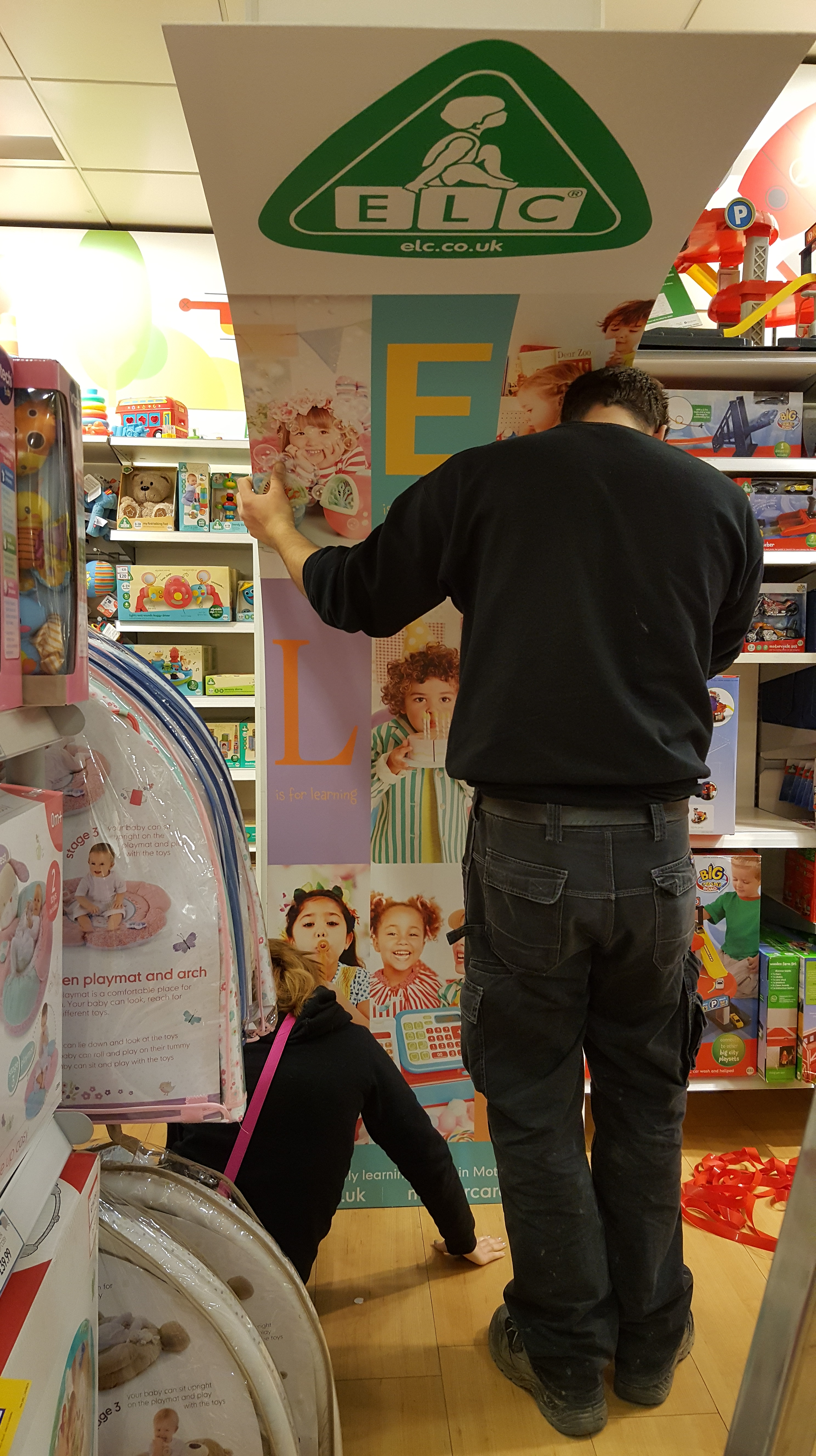
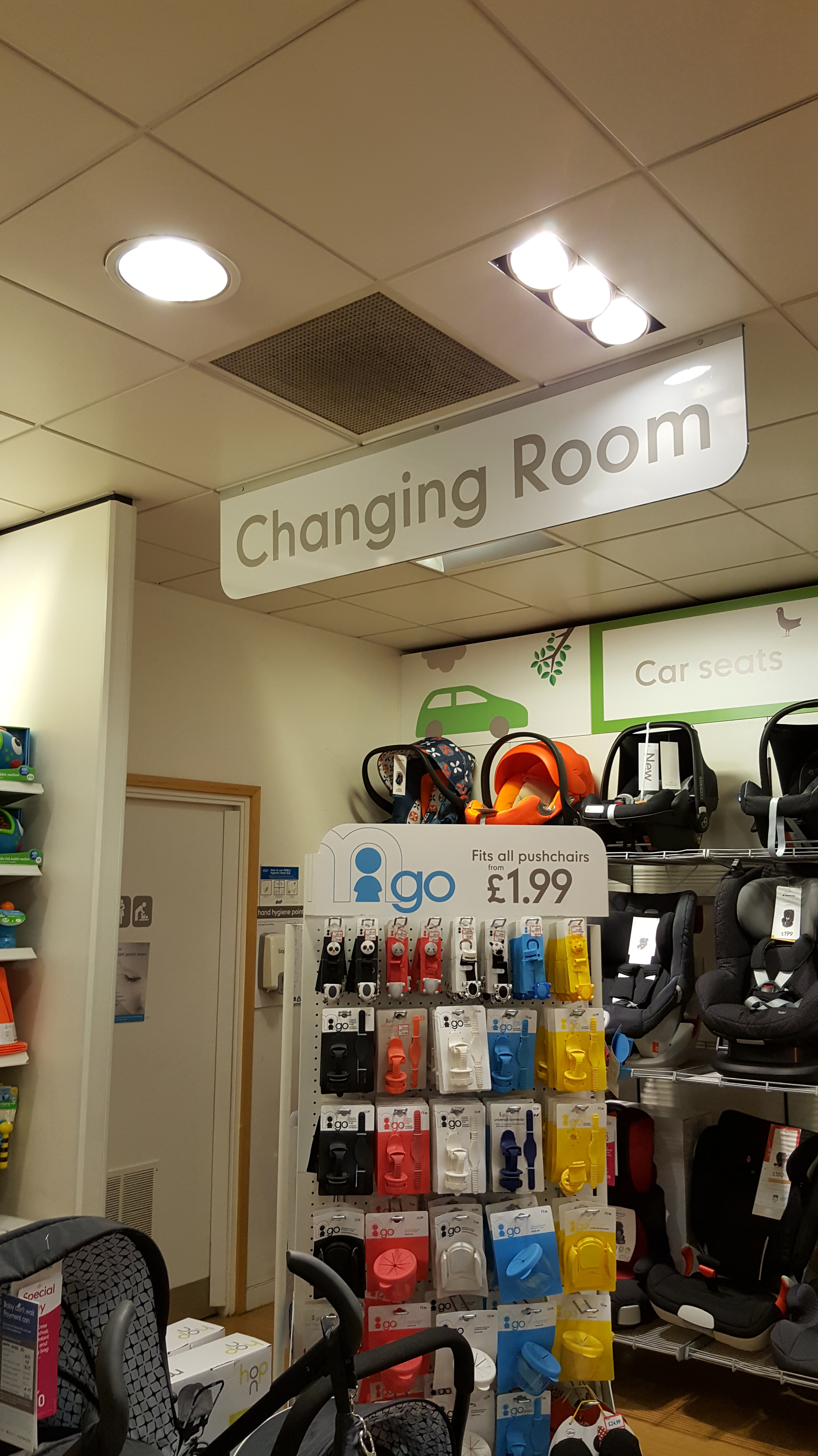
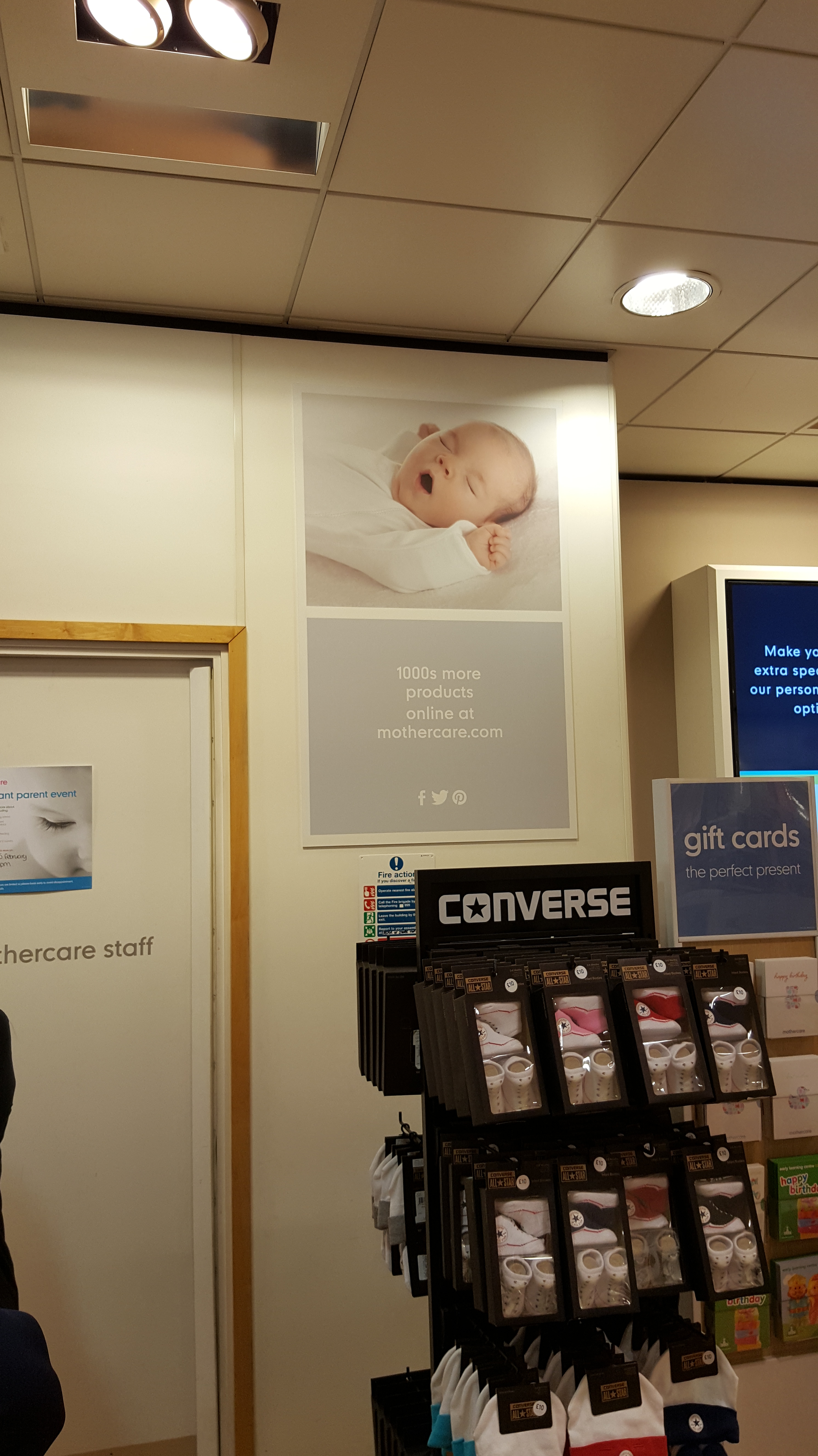
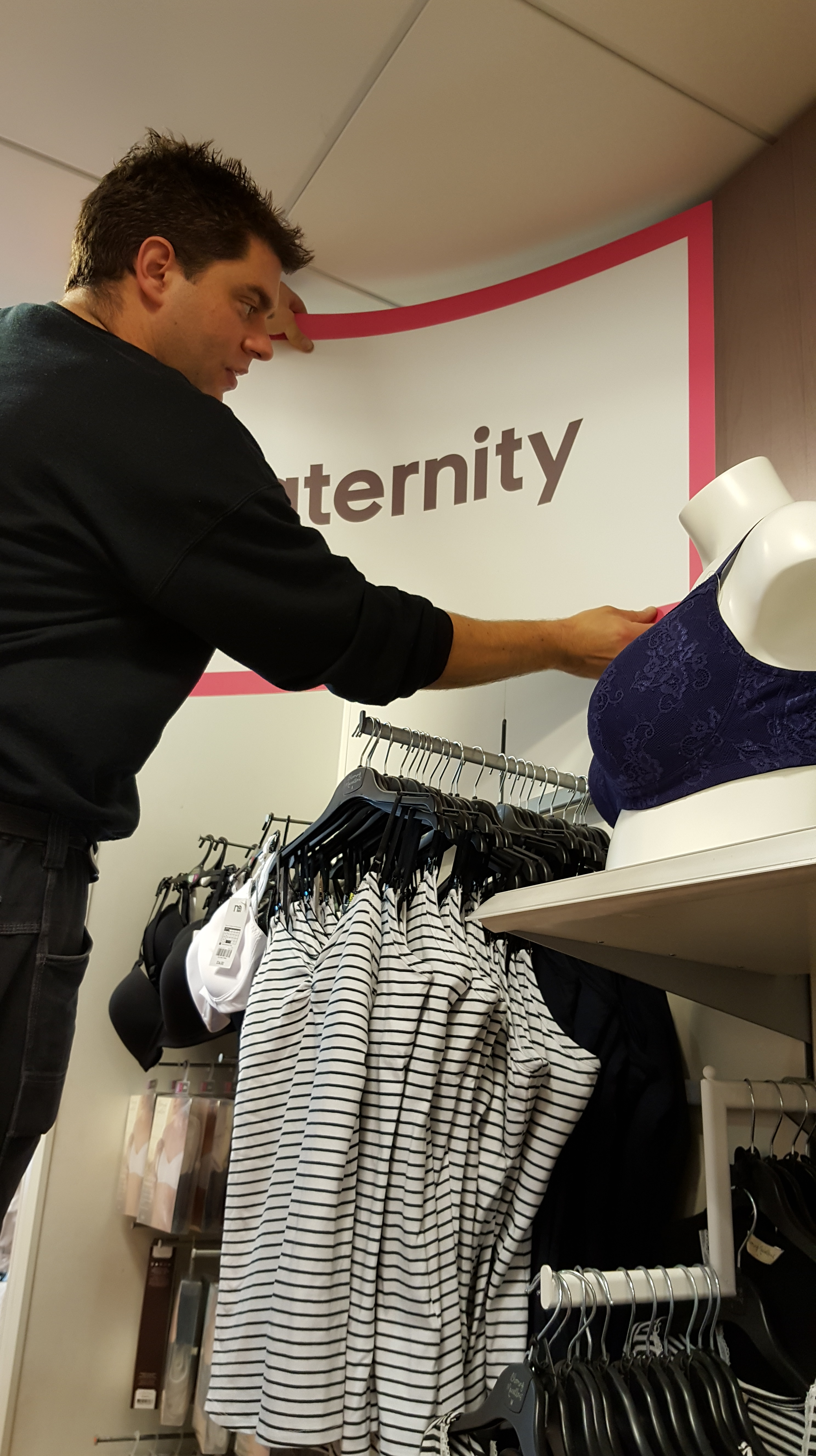
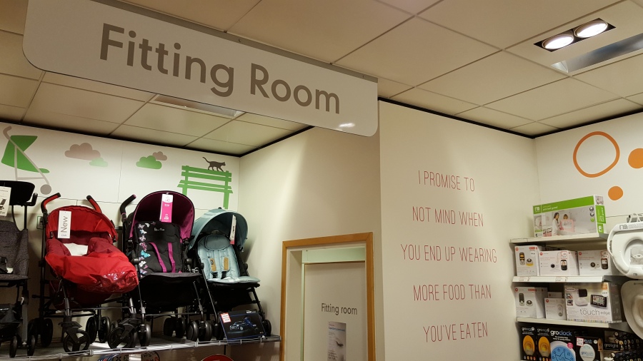
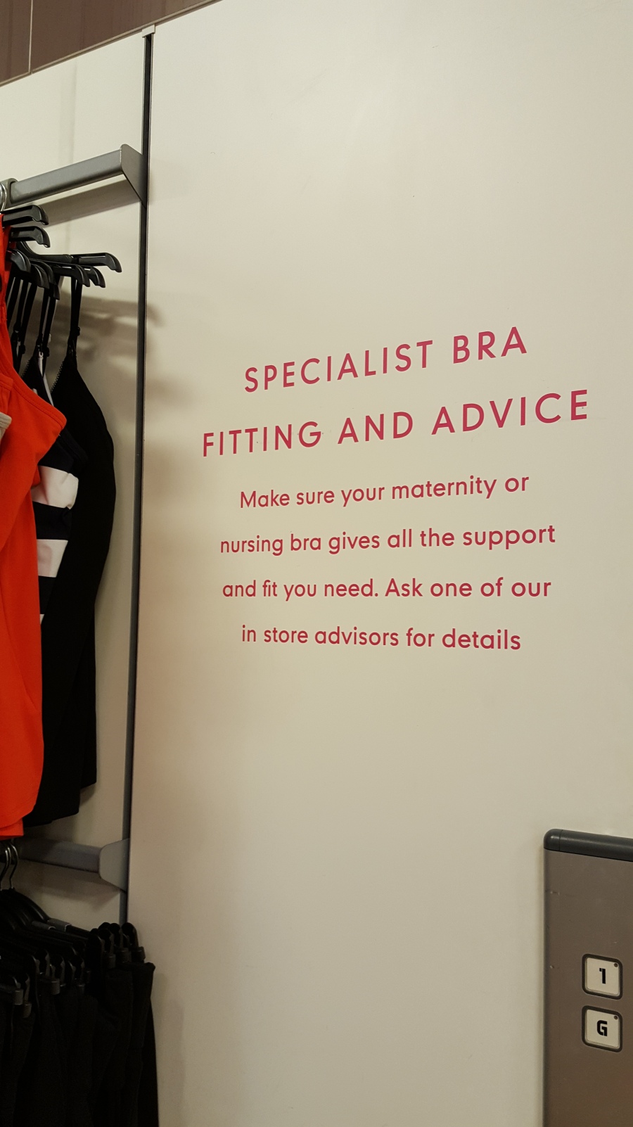
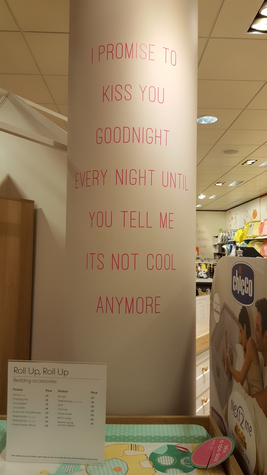
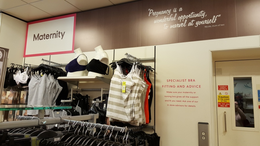
All of us completed our shops and took pictures of what we found in each shop when we saw the product; we talked about how the shelving was laid out and a little about the packaging that we found of the products stocked by the superstore. One issue that we had with our shops is that when Gemma went into Mothercare, they didn’t stock Hipp Organic, even though on their site it says that their product is available in Mothercare, so this was a little disappointing and she chose Boots instead. Unfortunately Gemma has been off for two weeks and has missed three sessions that we have had together as a team which means she hasn’t been there to hear our ideas and what else we may need to do for our research and for our rebrand project, but I have been in contact with her over the phone and filled her in with everything she has missed as I have taken notes for each session. Another issue we have is that the Sainsbury’s shop has yet to be completed.

When we had done our shops, we thought about the audience that could be being targeted with this product and had different ideas on what types of mums would want to buy the product. Jason got in contact with us shortly after his visit and gave us a few pointers about pinpointing our audience even more so we came up with the idea of creating a questionnaire for mums to fill out and we can obtain averages from the results to pinpoint a very specific audience.

We have all kept in contact through a group Facebook chat so that I can encourage the others to do a little more within the group when they have finished their specific tasks and so that we can ask each others’ opinions of any ideas or comments that we may have on each others work or ideas that we could all talk about during research.

I even wrote a few lists and send them to the group chat so that when there are times when we are busy we have things to do when we are not able to reply as quick as other days.

Over the half term we are going to start looking into the logo of the brand and finding out what makes it good and what lets it down, which we can then take on board for our own designs. I also have written a list of things that we can do over half term so that again, when others are busy and we can’t reply straight away we can just refer to the list and see what else needs to be done.

Age Ranges of Hipp Organic Products

Untitled

When it comes to baby food, there are normally age ranges to a certain product because of the baby’s development. With Hipp Organic, when you search through all of the products that they supply, there is a button you can tick to search by age and it comes up with all of the ages that they provide products for. This means that the audience for the product would be mums with children that are within this age range (from 4 months to 18 months). You can also search by product type, meal, or by special diet. So if your child required a special type of diet, like gluten free or suitable for vegetarians, then you can easily source them and be able to buy them the shops that are indicated on the product information.

Untitled2

Summary of Packaging

Hipp Organic have a wide range of packaging choices for their products. We went into some of the shops and took pictures of their packaging. They have jars, pouches, tray meals, and the ones that we didn’t find were the drinks, cereals, and fruit pots that they also stock in superstores. The way that Hipp Organic have designed their packaging has had a lot of thought go into it. They are stable and there are no choking hazards, for example the lid on the pouches are too big for anyone to swallow. By having a wide range of packaging they can target a lot of different consumers of different ages, especially when it comes to the age of their child. The age of their child depends on the type of product that they would buy. If their child is quite young then they would want to go for the smoother products that are for 4 months and above, and then the foods get more solid as the child grows older as defined by the packaging.

My Shops

I went into my local Morrisons & Waitrose shops to find Hipp Organic baby foods. When I went into Waitrose I couldn’t really find anything, they had a lot of Ella’s Kitchen, Heinz, and Cow & Gate products, but I couldn’t see any Hipp Organic. When I went into Morrisons, I found the product I was looking for! I took some photos of the shelving so that you can see how they have arranged the products.

20160215_113603.jpg

There is a mixture in brands on the shelves. There are Cow & Gate, Heinz, and Hipp Organic. There is no real organisation when it comes to the shelving, it seems as though they have put similar products together in terms of flavour and age range, which makes it easier for parents to navigate through the shelves and find what they need with ease.

20160215_11361420160215_113805

As you can see, the jars are all quite cheap and they even have a deal on them, if you buy ten, you can have them for £5, and seeing as they are just under £1 each, that is nearly half price. This could be a potential method to pinpoint consumers to buy Hipp Organic. Although the deal in Morrisons is covered across all of the baby food jars, consumers can buy a variety of brands as they all have different flavours, and can see how their baby will react to the different flavours. If the baby likes a particular brand of baby food than the others, then consumers will be more inclined to buy Hipp Organic. On the other hand, they might be more inclined to buy Cow & Gate or Heinz.

On the packaging side of things, Hipp Organic have a very colourful range of products. Their flavours are quite extensive and they seem to focus a lot more on the healthier option of fruits and vegetables, rather than home made meals like Cottage Pie, and Roast Dinners. The labels that appear on their jars are quite photographic in their design. The images that appear are the main ingredients in the jars which makes it easier for consumers to know what is in the jar, than having to read a tiny print on the back of the labels. For example: The banana yoghurt jar has only bananas on the label, whereas the apple and cranberry has both apples and cranberries on it.

One thing I chose to do was to take the labels off of the jars and scan them in both colour and black and white to see how they would look. One rule about design is that if you have a logo or label, design it in black and white so that you know it will work in colour. If you have a good design in a greyscale style then it is guaranteed to work no matter what colour you put onto it. I think that the logo could be improved in the way of its typefaces and shapes within the typeface (the heart in the P and the I) but the colour is what makes the brand. By looking at the greyscale and colour versions side by side I can see the the colour choices of the logo works well in both styles. This could be something to consider when we take on our rebranding challenge.

Who are Hipp Organic?

logo.png

They are an Organic Baby Food company, which was founded 100 years ago. Their aim is to deliver a suitable, affordable and healthy range of baby foods that will help child development and growth. It’s crucial that we still portray this ethos in our designs. This logo is their most current, which still keeps elements of their first logo, so you can see that they are running a “green/eco” theme.

As our brief states that we need to design web mock-ups too, we looked at their site and it portrayed the same aspect, however, as a group, we felt that both the logo and website looked very dated and somewhat unappealing, due to the colours, fonts and shapes used.

Screen Shot 2016-02-05 at 15.16.19Screen Shot 2016-02-05 at 15.16.46

Google Trends

I looked on Google Trends to see how often the top two brands as well as Hipp Organic are searched online, and they all have a similar amount of searches over the years.

Google Trends.png

https://www.google.co.uk/trends/explore#q=Hipp%20Organic%2C%20Cow%20%26%20Gate%2C%20Ellas%20Kitchen&cmpt=q&tz=Etc%2FGMT

Cow & Gate: June 2005

Hipp Organic: June 2006

Ella’s Kitchen: March 2008

From these dates, which is when the product was initially searched for there has clearly been a competition for which baby food is best judging by the amount of searches they have on Google. As of February 2016, Hipp Organic are on top of everything, Ella’s Kitchen is second place, and Cow & Gate that was previously the top search of the three, is now the bottom search.