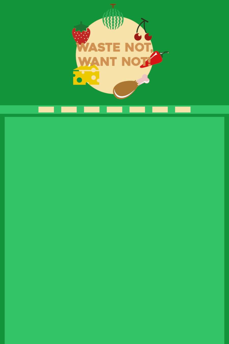
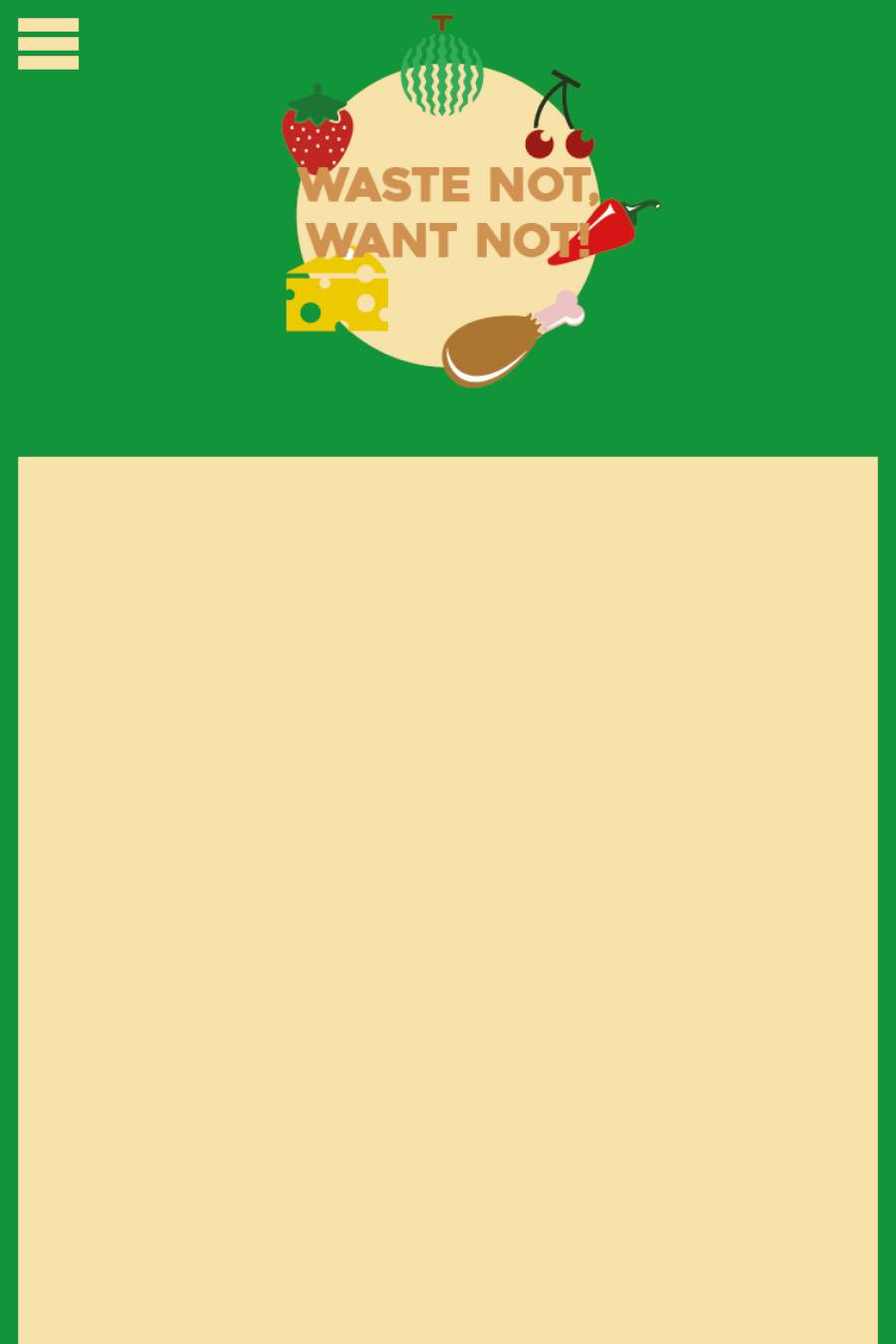
These are the mobile designs for my site. I was thinking about keeping the navigation the same as the desktop and tablet sizes because of easy navigation through the page. However, most mobile sites as I have seen in my research, have a hamburger menu which condenses down the navigation bar to a handy side menu that you can click wherever you are on the page. I am going to take this into consideration when it comes to building my site for different platforms, and even within the desktop site so that when you change the screen size, you get to see the hamburger menu.
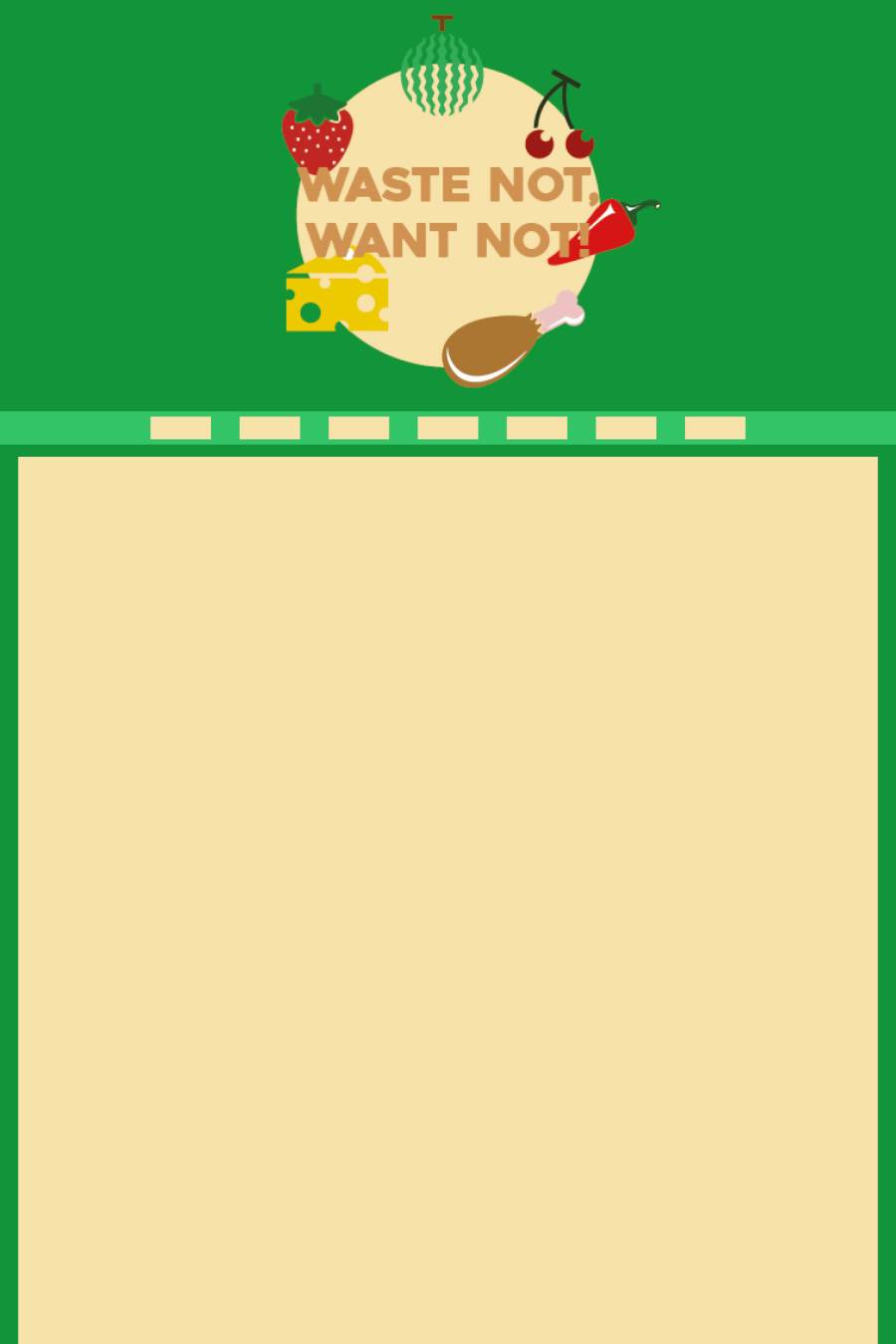
This is a tablet design that I came up with. By looking into normal websites, I found that the tablet websites were very similar in terms of layout on the tablet to the desktop. I think this is because tablets can be quite large so would be more likely to work as a full website, very similar to the desktop site.
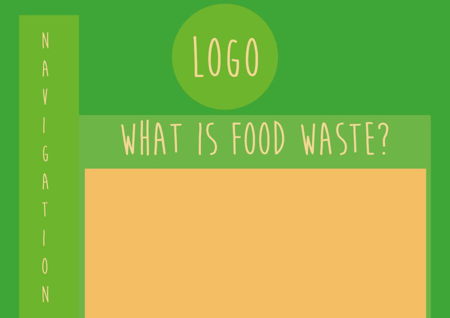
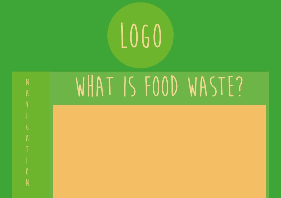
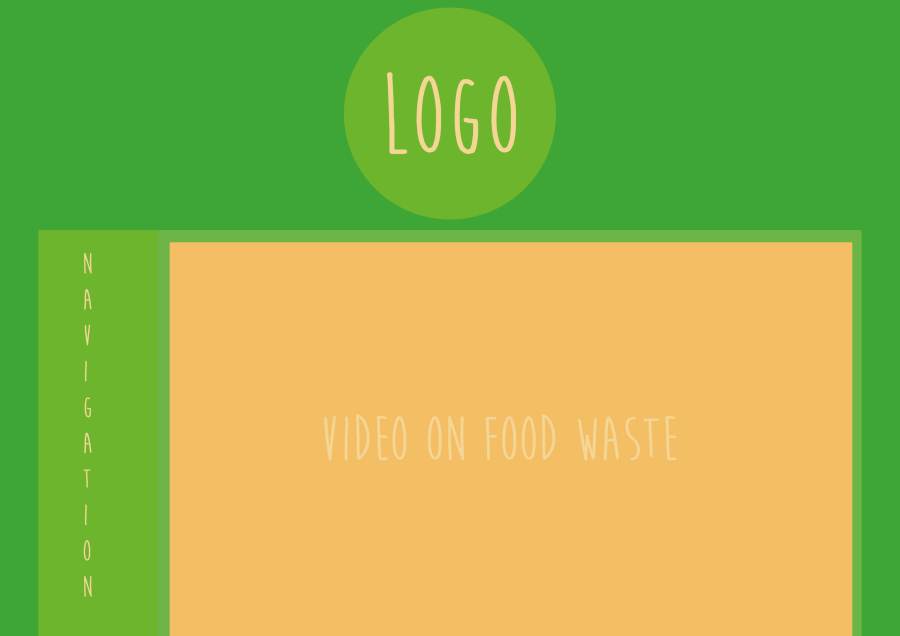
This is the second group of designs for the desktop which include my logo. I really like these better than the other ones because there is more of a scheme to it. The colours in the logo make it easier to get a consistent colour scheme. I can match colours that are in the logo to colours that I would like to see on the page. This could make the page look more professional and it would also show that the design has been taken into consideration.
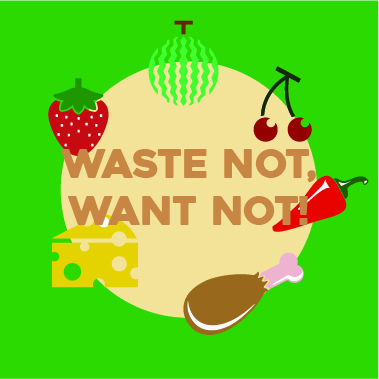
For my assignment website, I created this logo to turn into a page link so that you can click back to the cover page for the website which looks a little like this.
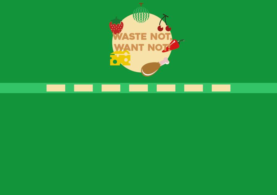
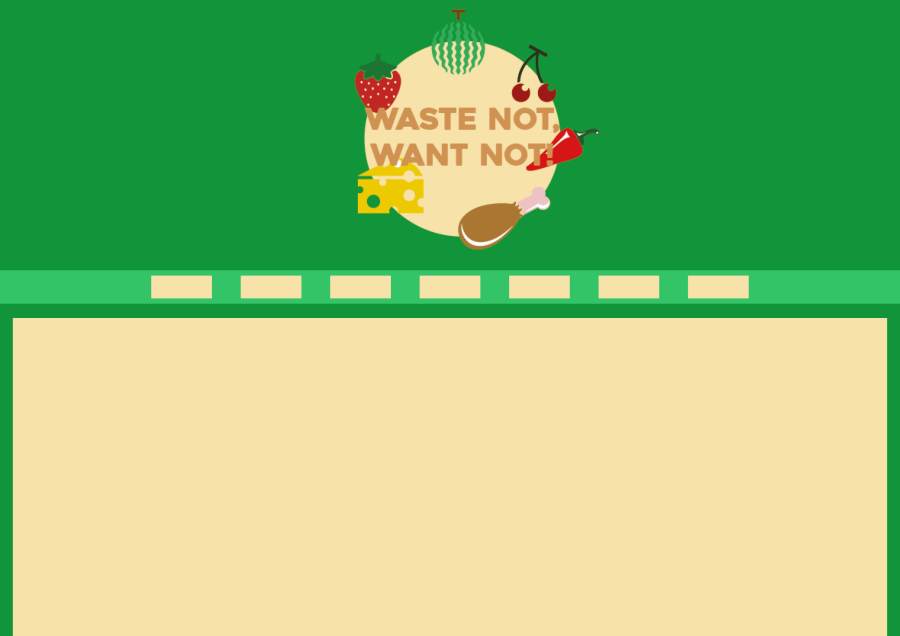
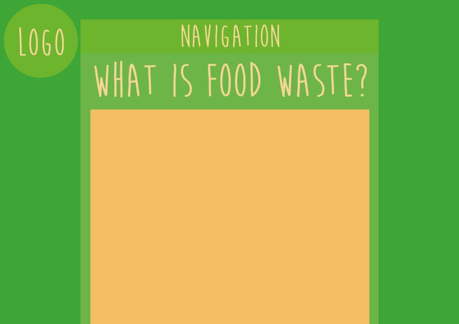
These were the first designs that I came up with for my page, just to get an idea of where the logo would go and where I would like the navigation to go. I decided to create a logo for the page to make it look a little more professional as an information based web page.
There are two ways that you can lay a page out, and these are by using floating and the inline-block display rule. Both ways are good, one uses display and one uses floating.
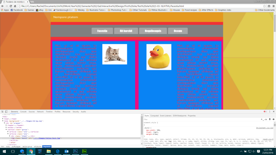
By using CSS we can make a box model which helps us see how a page is laid out. You can look at any website by using the developer tools in a browser.
What are developer tools?
All browsers have it, Microsoft Edge, Firefox, Chrome, Safari; but what are they? You cannot do web design without it. If we see something on a site and we want to find out what it is, then we can find out what it is by using these tools.
If we look at our site, we can right click on an element and click on inspect and it would come up with a little window at the bottom of the web page with the HTML on one side with the element highlighted and the relevant CSS on the other side.
We see rules for the elements and we can check and uncheck different things in the CSS that we do and don’t like and to see the changes and see with or without.
Developer tools are very useful and it can be a little more complicated. You can hover over an element of a page to see what each element contains in HTML and CSS. If we click on article, we get other things, like from the article CSS and our classes for the paragraphs in the article. We can add stuff and uncheck any stuff that we change to get a feel for what we’re doing right or wrong.
Anything you change in the browser developer tools, will not stay.
If we bring up the developer tools and click on the plus in the corner, we can add a new rule. To create the box model in CSS we want to put a border in so we can see all the elements. So type *{border:solid 1px red;}.
* means everything.
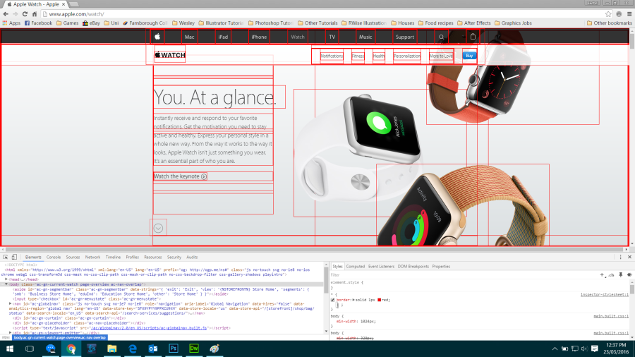
This lets us see what elements are on the Apple page.
I have recently become the admin of The Old Manor’s official Facebook page, so my duty is to post about deals and any information of events that we may have coming up onto the page. I was given the page on 14th March 2016, and it started off with 834 likes. When I started posting things on the page, I gained the page 205 likes, which means we reached our 1000 like milestone.
By being given this page it has given me the opportunity to do something I love, which is advertising, and because it is my place of work it is easy to find things to post about.
Here is a link to the Facebook page – give it a like while you’re there if you like!
Today we had a meeting about the logo that we chose as a group on Wednesday (16th March) didn’t match the target audience that we were trying to pitch to. The target audience that Hipp Organic currently pitch to are younger mums who can afford cheap food, so aged about 21-25. When Flourish came in and had a talk with us, we said that we wanted to pitch to a slightly higher demographic so that we could raise the price of the product.
Something that Emily brought up in the meeting that we had, was that her market research was aimed at children, whereas mine and Gemma’s were aimed at mothers. She thought that this might be an issue but it’s not as people research different things so that we can decide on who we want to target.
We’ve decided that we are going to take the top two logos to nurseries so that we can show mums, and find out which mums like which logo better and go with the majority vote. By going to the target audience personally and saying which logo do you prefer, that gives us more of an idea as to which logo we need to put onto our packaging and so that we can start designing for other aspects of our brand.
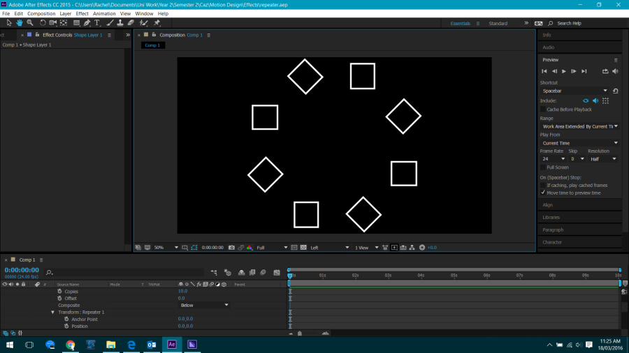
Today’s lesson involved playing with different effects and animating shapes to do different things. Where the add menu is, we used the trim paths tool last lesson. This time we’re going to play with the bottom third of the menu which includes wiggle, twist, repeater, round corners etc.
When trying to animate a shape, it depends on which order you put the effects in otherwise it won’t work. If you put rounded corners after a twist, it would not work because it wants to be rendered before the twist. If you drag it above, it will apply the rounded corners and the twist effects to the selected shape.
Pay attention to the order you apply the effects to your shape – if you have applied an effect and it isn’t working then it is because of the order things are in.
All of these effects can be animated – so we could start from a radius of 0 and as the star twists, the radius itself changes so that as it animates it also softens and becomes more rounded.
We have things like pucker and bloat, which can do all kinds of weird and wonderful things if you push them. If I put a pucker of 0 and shift it to 80 along the timeline, all it does is pull the handles in and out. If we go forward it pulls the anchor point in, whilst keeping the angles, whereas if we pull it the other way (-80) it pulls in the side beziers and pulls out the anchor point.
You can create a shape that is animating, and duplicate the shape and resize them around the original shape. After doing so, pre-compose it because then you can just drag the shape you just created into the project and resize each one so that you can then animate them to come in at different times and change their colours etc.
The wiggle paths effect is a self animating effect, which means we don’t need to add keyframes but if we wanted to make it wiggle halfway through a composition, then we can use keyframes. You can make changes to it so you can decide how much, how little, how wiggly, and how many “wiggles per second” you would like.
You can add adjustment layers to your compositions which you can edit. There are many many many different effects that you can choose from but this time we’re going to go with Gaussian blur and put it over the top of the composition. You can change which layers it will blur and will not blur.
The repeater tool makes straightforward effects that look more complicated than they actually are. The repeater is useful, if you hit the button it will create repetitions of the shape or text and in the option, you can choose how many copies, where you can offset it etc.
I chose to experiment with flowers leaves and watercolours with our final logo to see which we would like to see on our packaging out of flowers, jungle animals, woodland animals, and fruit & veg.
I also tried the other logo that we couldn’t decide whether we liked or not just to see what it would look like.


 RWise Designs