Assignment – Final Cover Designs

These are my final prints for the book covers. I think that they look successful as a set because they have very consistent designs throughout and they all look the same. I think that the authors name and the icons used gives it a series look because they are of a similar colour, shape and design of the cover as a whole looks the same.

book finals.jpg

Assignment – Book Cover Design: N or M?

This design was a little different from the others when I first started it. I chose to mix the letters N and M together because then the title of the book would make sense, being the letter N or M. I chose to put the black words for or and the question mark at the separation and at the end of the letter N and the letter M.

tumblr_inline_nikqelKpRV1t30awu

I changed the colour of the poster from teal to a dark shade of purple because I already had a blue poster. I prefer this colour for the poster because it contrasts against the white really nicely and the grey still stands out well.

tumblr_inline_nikqje70UQ1t30awu

I changed the icon on the front cover of the book because there were some legibility issues with the title when the letters N and M were merged together. I did a little research into the book and found out that there are 2 German spies called N and M so I chose to put the icon as a spy. I think that this works better because it will match the other book covers and then look like a set.

tumblr_inline_nikqnjywr51t30awu

Assignment – Book Cover Design: Partners in Crime

This is one of the designs for her book called Partners in Crime. I think that this design is a little different from the others because there is 2 images on the cover. I thought that this would be a good turning point in the experimentation because of just adding one image to each book; it could begin to be a little boring. However, by adding 2 images to this cover design, I would have to add 2 images to the other book covers to make it look like a set as that is the aim of the brief.

tumblr_inline_nif80mrDeV1t30awu.png

This is an inverted version of the first design. I think that the other colours on the design works better than this one because of the colour association with criminals. A darker colour, like black and darker shades of grey would associate more with criminals as the white on this book cover makes them look a little more innocent.

tumblr_inline_nif8opG9X71t30awu

This is the design that I chose to go with in terms of making the books look like a set, with the white image and the title in the lighter shade of the same colour as the background. I think this design works better than the others because they look more like they are part of a set with the other two. The white of the image really jumps out on top of the darker blue. I think that it looks a lot better in terms of composition as well.

tumblr_inline_nif95maB4q1t30awu

This is the layout experimentation for Partners in Crime. I think that this works well in terms of composition because it takes up nearly the whole space of the cover and it does well in terms of inform the reader. The title is big so the readers know what the book is called, however the authors name is small so the reader will have to look closer for it but not too much.

tumblr_inline_nif9vnNspe1t30awu

Assignment – Book Cover Design: Spider’s Web

This is one of the first designs I came up with for Spider’s Web. Similar to the first design that I came up with for Appointment with Death because they are supposed to look like they are a set of books. I like this as a design because of the imagery and the text complementing each other.

I chose a deep green for this cover because spiders live outside and are mostly found in bushes and plants so it seemed necessary. I think that having the authors name and the image in white, again, is also quite plain. The authors name in white takes away from the image and doesn’t make the image look as good. I like the typeface for the title of the book because it is a display font.

tumblr_inline_ni886mFeVa1t30awu

This is the second cover design I have come up with for Spider’s Web. I liked this design from the Appointment with Death book cover and thought that it would look good as a set. I like this design not only because of the imagery but the colour as well. I chose a lighter green than the background for the title of the book because it complements the background and ties in well. One thing I changed on this design is the font for the title of the book because if I want the books to look like a set then there needs to be consistency within the designs. I used the typeface Aliquam for the title of the book which is a simple typeface and complements the script typeface, called Champagne.

tumblr_inline_ni88hjQB9T1t30awu

This is another layout design for Spider’s Web. Exactly like the Appointment with Death experimentation with layout. I think that this one works better than the Appointment with Death cover because the title is shorter for this book than the other so there is more room for the image.

tumblr_inline_nif5adsaid1t30awu

Assignment – Book Cover Design: Appointment with Death

This is the first design I came up with for Agatha Christie’s “Appointment with Death. I chose a deep red colour because of the word death in the title. The colour connotation is strong with this design and I think that having the author’s name in white is a good aspect of the design because it stands out and you can clearly see who wrote it. However I think that there are some flaws in this design, one being that the illustration is black. The dark red colour behind the illustration makes the illustration a little difficult to see because you would be focusing more on the colour. With the word “with” in the middle of the calendar icon, you need to strain your eyes to see what the word says clearly. Also, with the actual title of the book not being on the cover makes it difficult to actually see what the book is called.

tumblr_inline_ni86orcHpy1t30awu

This is my second design for Appointment with Death and I think that it is a little more successful than the last design because you can actually see the illustration. There are a few things that I changed in this design which was the colour of the authors name, the colour of the illustration and I added the title of the book to the cover. I think that these aspects helped the design a lot more because they are main elements of a book cover. A book cover with no image or no title would be a very poor book cover because it doesn’t tell the reader / viewer anything about it. It would be like having no author on the front cover. The reasons I added the title was because of this.

Making the illustration white was a huge turning point for the design because when something so bright stands out on a dark page it draws the eye in so if this book were to be on the shelf in a shop, I would look at it because of 2 reasons. 1 of which is that I like the design, and the second reason is because it stands out. Adding the title to the book cover was also a good idea I think, because it gives the reader the information they would first think of; “what is the book called?” Also, changing the colour of the authors name takes the attention away from it being white. In her original book cover design her name was the largest piece of writing on the cover so to be different I have taken as much attention away from her name as possible.

tumblr_inline_ni877rUuyP1t30awu

This is the other design I came up with but this is just a play on layout. I based it on the first thumbnail layout that I came up with. I think that this works as a design but there are some things that I do not like about it.

I do not like the fact that the main aspects of the design are the image and the title. Although my intentions were to take the attention away from the authors name, I think that this is too much attention that has been taken away. We read the page from top to bottom and from left to right. (Top left to bottom right) So in theory, the last thing that the person looks at on the cover would be the authors name so that would be the last thing they remember from looking at it.

tumblr_inline_ni87xxWXBP1t30awu

Assignment – Thumbnails

These are some thumbnail designs that I chose to roughly type out in Adobe Illustrator. I chose to create 6 artboards so that I have a variety of designs to chose from when it comes to actually designing the book covers. I particularly like the fourth book cover thumbnail because it is a different way to see things. The image will be the first thing that the reader will see but the image should be something that relates to something that is about the story in the book. Most classic book covers start with the title of the book at the top of the book, followed with an image, and then the authors name at the bottom because of the way we read a page; top to bottom and left to right.

The other thumbnail I have taken a liking to is first thumbnail because the title of the book will be the biggest thing, then the image straight after, however the different thing is about the author’s name. The author’s name being smaller than usual insists that the reader or viewer is looking for the authors name in the design which could help engage other audiences.

tumblr_inline_ni83a2v2uR1t30awu

Assignment – Minimalist Designs

I have one particular style that I like when it comes to book cover design. I prefer minimalist designs because they have such a heavy affect on the reader but yet they are so simple. For example this series of fairy tale book covers remade in a minimalist fashion. They take one thing from the story and turn it into an iconic object and a recognisable trinket, but it also makes the audience realise what the covers are without having to think hard about it.

Minimalist book covers.jpg

This is another inspirational group of book covers that I have found based on the Harry Potter series. By using small images and colour schemes on the same book cover. One image on each of these book covers relates to something in each book. For example, on the cover of the Order of the Phoenix, the image is the prophecy ball that the six students come across while trying to find Sirius Black in the Department on Mysteries.

tumblr_inline_nhv8w3k2v11t30awu

Assignment – Introduction & Cover Analysis

For the assignment for this module, I was tasked to create a series of four book covers that would work as a set. The design of these covers should clearly speak to the target audience and should each have a clear system that identifies them as being part of a set. This identifier may be a grid system, typographic element, illustrative style, or all of these elements combined. The author of these books should be one chosen from the following list:

  • Paul Auster
  • Don DeLillo
  • Margaret Atwood
  • Bill Bryson
  • Agatha Christie
  • Aleksandr Solzhenitsyn
  • Toni Morrison

The author that I chose was Agatha Christie and I started by choosing four books with names that I thought would be easy to illustrate in a minimalist way. The books I chose were “Appointment with Death”, “Spider’s Web”, “Partners in Crime”, and “N or M?”. I started off by analysing each book cover.

Agatha Christie books

Agatha Christie’s “Appointment with Death” book cover shows a snake that is digesting something. This is typical iconography of death as snakes eat almost anything they can because of the way they hunt and the way they eat things. The colour scheme uses very neutral colours including cream, brown, and some orange. The book cover altogether is very iconic in the style of the image because the images are very simplistic and they do not have very much detail. The typeface along the top is a script font in one of the darker colours on top of the lightest colour on the cover. I like that the first thing you see is the black snake, then the name of the author and then finally the title of the book. It is different to have the authors’ name bigger than the title of the book because people could get confused as to what the book is called. Overall I think that this is a good book cover design because of the strong use of the colour black. One of the first things that you see on the book cover is the black snake behind the lighter colours of the background so it drags the viewer’s eyes in to look at the book.

This is another of Agatha Christie’s books that I have chosen to redesign as a set. It is called“Spider’s Web”. I like this book cover because it has a very similar colour scheme throughout as opposed to the previous book cover I looked at, “Appointment with Death”. The orange/red background really contrasts the mustard yellow that they type is in. It The author’s name is very big at the top so everyone knows who the author is and who wrote the book. There is also a very small but not unnoticed icon of a spider hanging from a web.

This is Agatha Christie’s “N or M?” book cover. This book cover is a little different from the previous two that I have looked at because the typeface is at the bottom of the book and the image is at the top. The author’s name is still 20% of the cover so we know who the book is written by. The image being at the top of this cover design makes people look at the image first rather than the authors name. I think that this is a better book cover than the rest because of the way it is laid out. I think that this layout is also better because you are drawn to the image first. People do say don’t judge a book by it’s cover, but in this case looking at the image first will help the reader decide whether or not to read it.

This is the final book I will be looking to redesign by Agatha Christie and is called “Partners In Crime”. I think this is one of the better designed books because it is very simple in terms of colour scheme. Brown for a neutral colour and white for the type to match the colour in the image too. I think that the shadows underneath the dice make the cover look better as a whole because it gives it an element of 3-Dimensional looks to it.


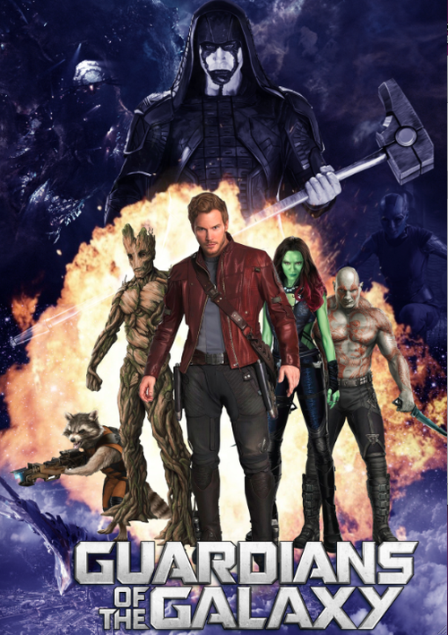
Guardians of the Galaxy film posters

Before Photoshop came about, most film posters were drawn by hand which was very time consuming and a very long process. A good example of this is the old Star Wars posters which was drawn by Drew Struzan, a famous artist.

Star Wars

By looking at these film posters, you can tell that hierarchy has a part to play in the composition because the main character of the film is seen as the largest figure. The largest figure could mean that the character is one of three, or a combination of three different things from a film poster:

  • The hero/villain
  • The character is first introduced
  • The most important character

Taking the hero and villain into account, one is displayed differently to the other. The hero normally has a lighter tone to their character whereas the villain has a dark shadow over them indicating that they are a dark character. A good way to show hierarchy in film posters is by using what some call the “diamond formation”. Theoretically speaking, this formation should lead the audience to look at the main subject matter, then work their way down through the characters in whichever order is shown.

Continuing to look at the Star Wars film posters, the colour palette shows a range of colours between blue and orange which acts as an advantage to the display of the subject matter because they are complimentary colours. They stand out against each other which makes it easier to emphasise action for an action movie because most explosions are orange, which would stand out on a blue background, like so.

tumblr_inline_nden1sESws1r6108v.png

The task given to me was to create a few posters, character based and by using hierarchy, but I had been given the image to use so that it made the task a little more difficult. By blending two backgrounds together and using pattern overlays and colour overlays, as well as fiddling with the sizes of the images, I created three character posters and one hierarchy poster which can be seen below.

Guardians-of-the-Galaxy-Wall-Decals-Rocket-Raccoon-1

Guardians-of-the-Galaxy-Wall-Decals-Gamora-2

Guardians-of-the-Galaxy-Wall-Decals-Ronan-the-Accuser

Guardians

Polygon Art

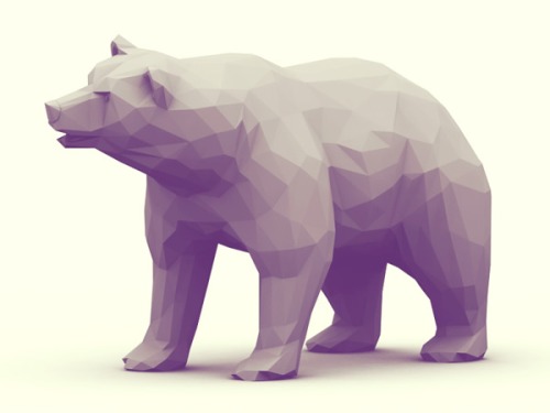
Polygon art is art that is made up of polygons. It is easy to create and looks amazing depending on how much detail you put into it; the level of detail depends on how big or small you make your polygons. Here are some example of polygon art.

tumblr_nbsq1hzr8D1rms5nso5_250

tumblr_n0ybe3RclS1rqdm9yo1_500

By using Photoshop and an image of something you like, or simple you can create a really impressive polygon art image. Using the lasso tool, you can create a polygon on a separate layer and then use the eyedropper tool to pick a colour from the selection you have just made. You then use the paint bucket tool to fill in the shape you have just created, and by going over the whole image with this method you can create something really spectacular just by using the lasso tool and the paint bucket tool. Create a new layer underneath the polygon shapes and use the brush tool to fill in the gaps between the polygons. I chose a Lorikeet as my image and this is my result.

Lorikeet Final Image.jpg